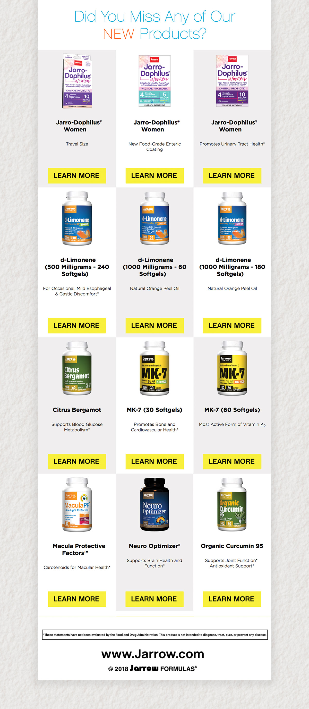
Jarrow Formulas Email Newsletters
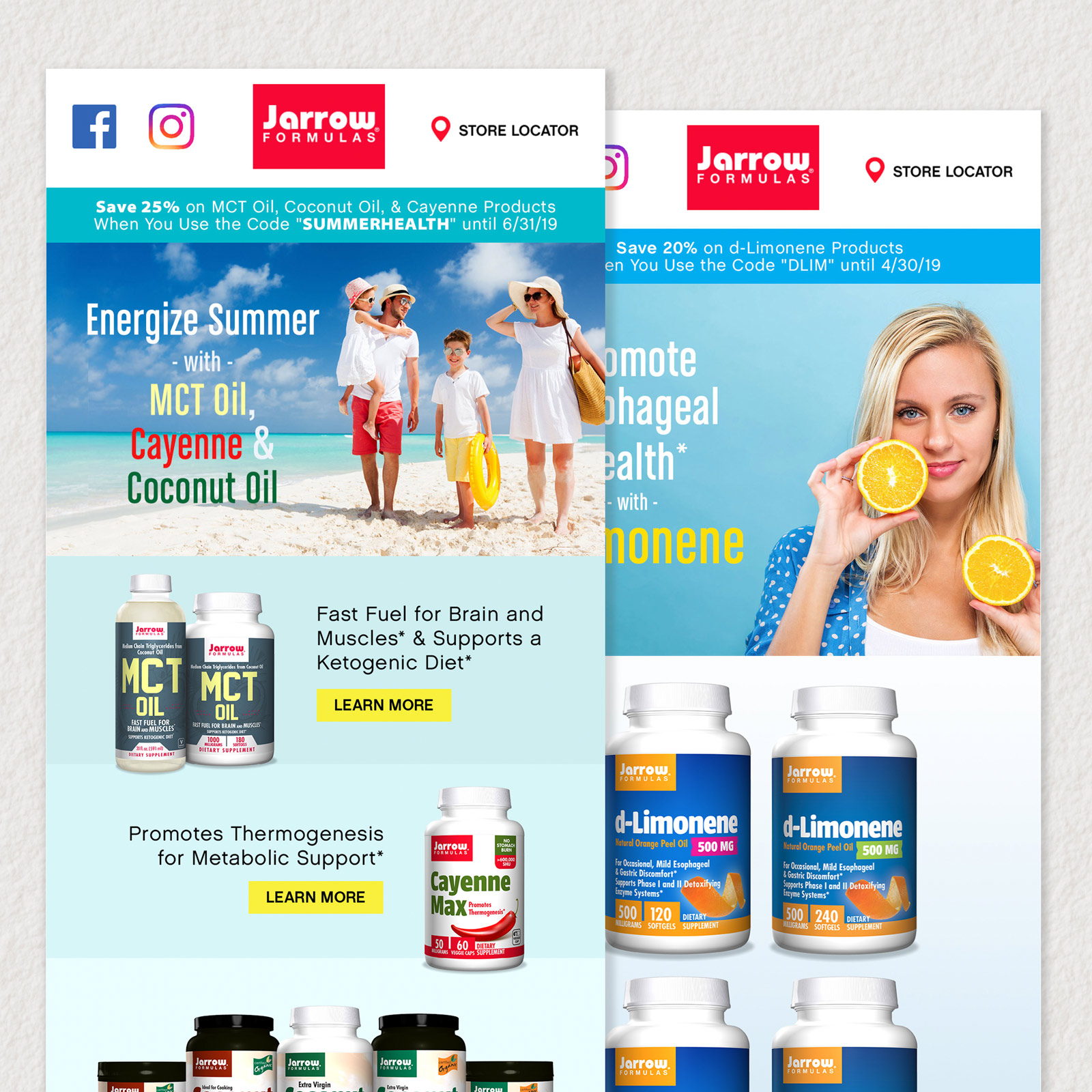
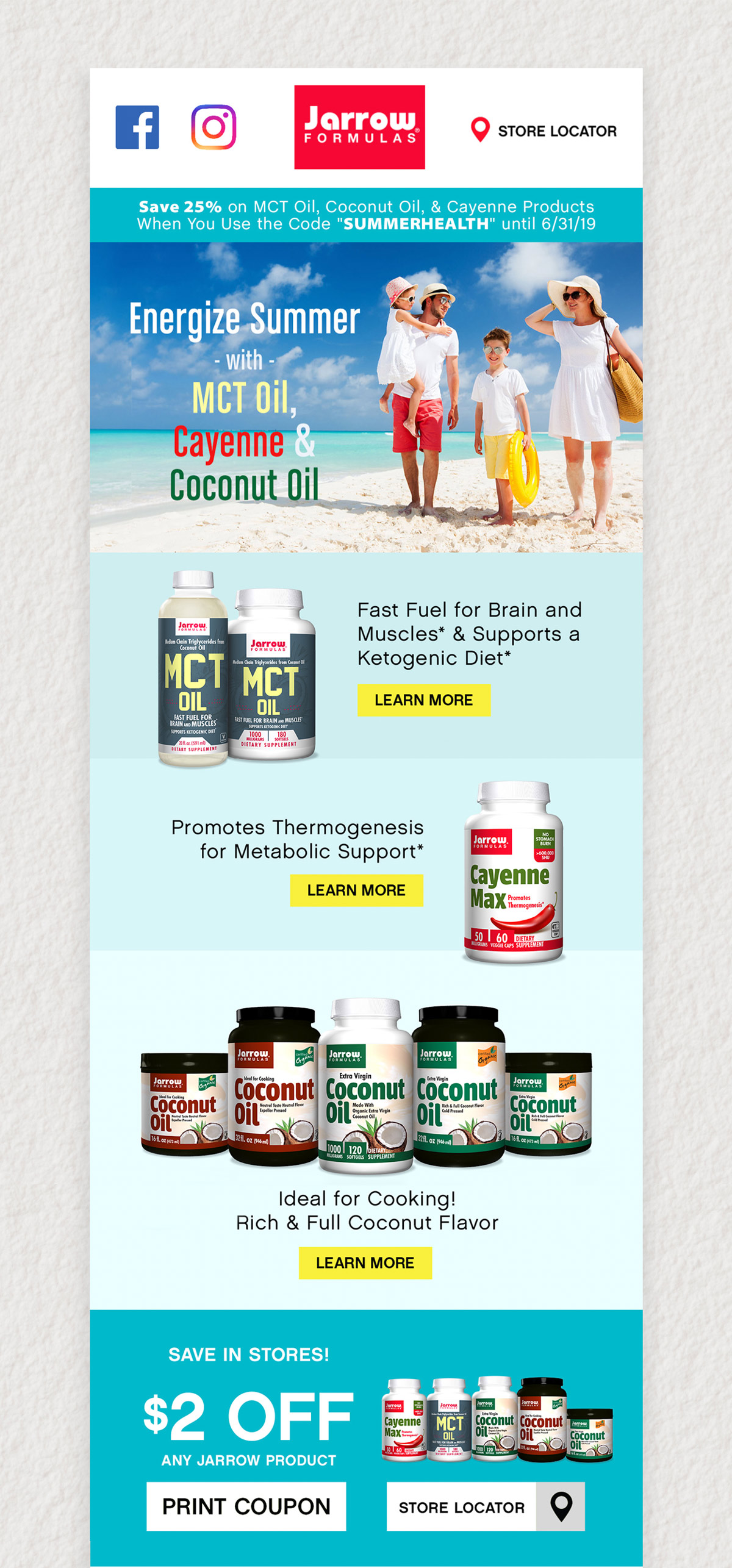
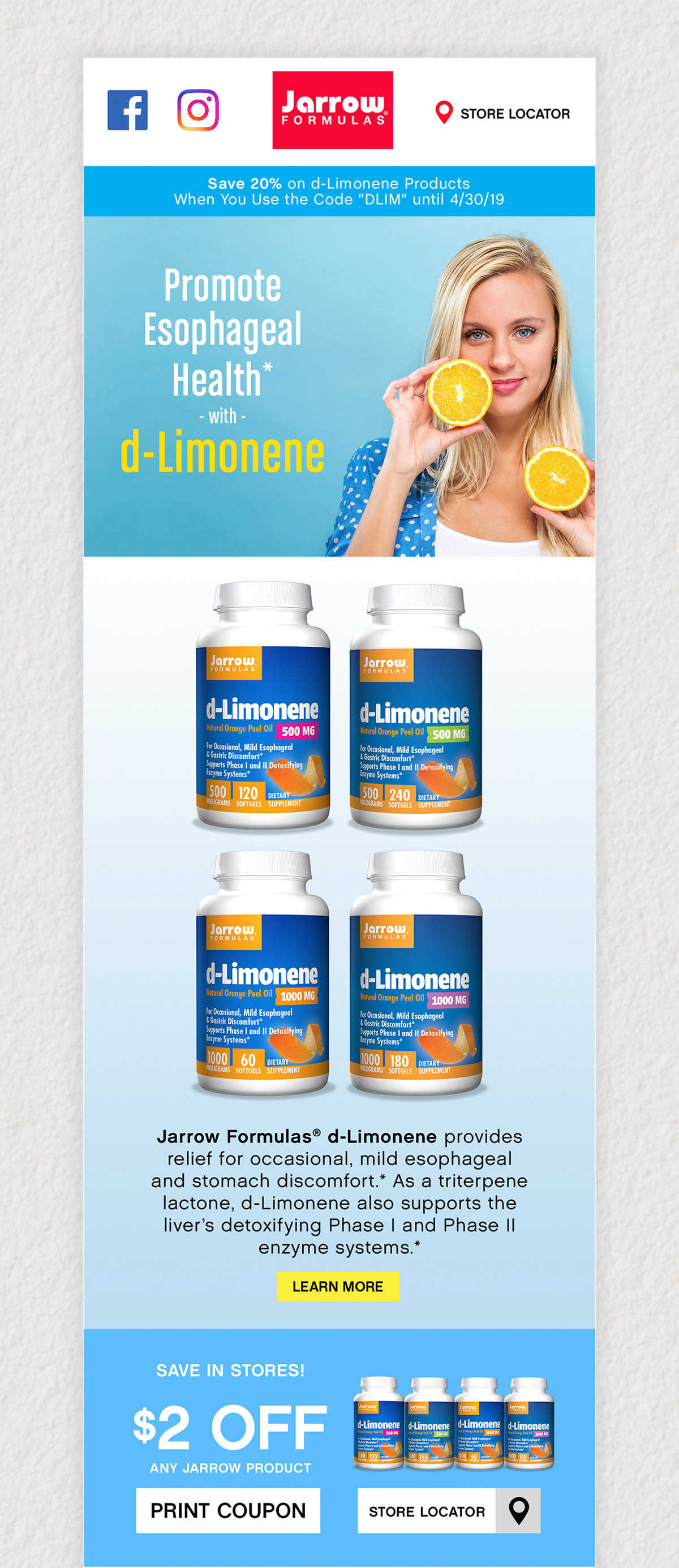
This was a digital design project for Jarrow Formulas’ email newsletter campaigns. I designed the new emails using Photoshop and built them with HTML5 and CSS3. The newsletters needed to serve as both an informational aid for customers, as well as a call-to-action to stimulate engagement and redirect to buying pages. During this redesign, I created a Photoshop and HTML5 template to ensure visual consistency.

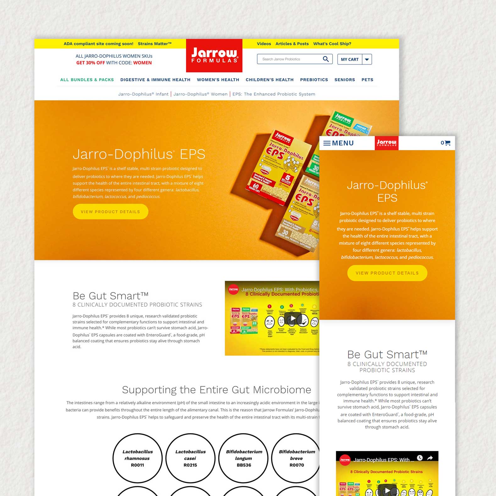
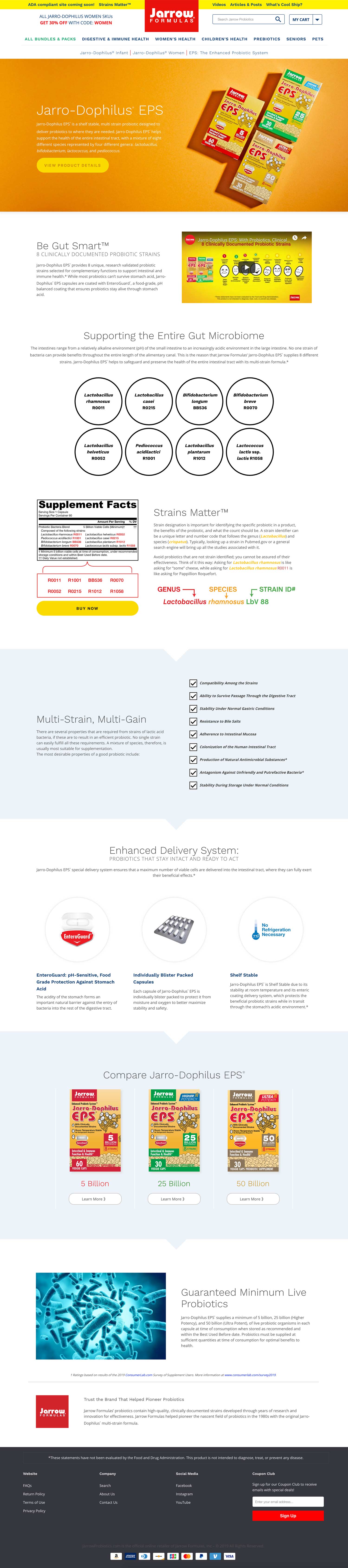
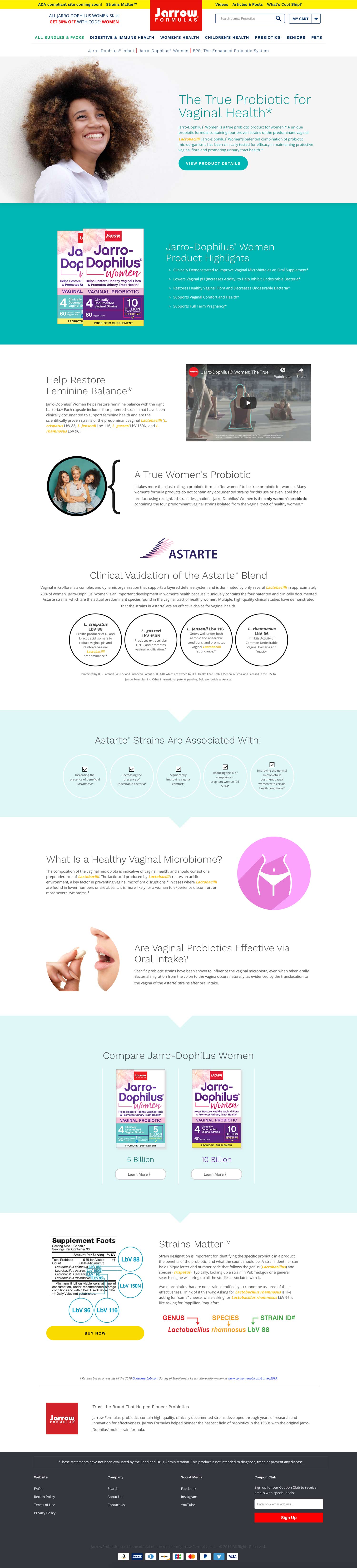
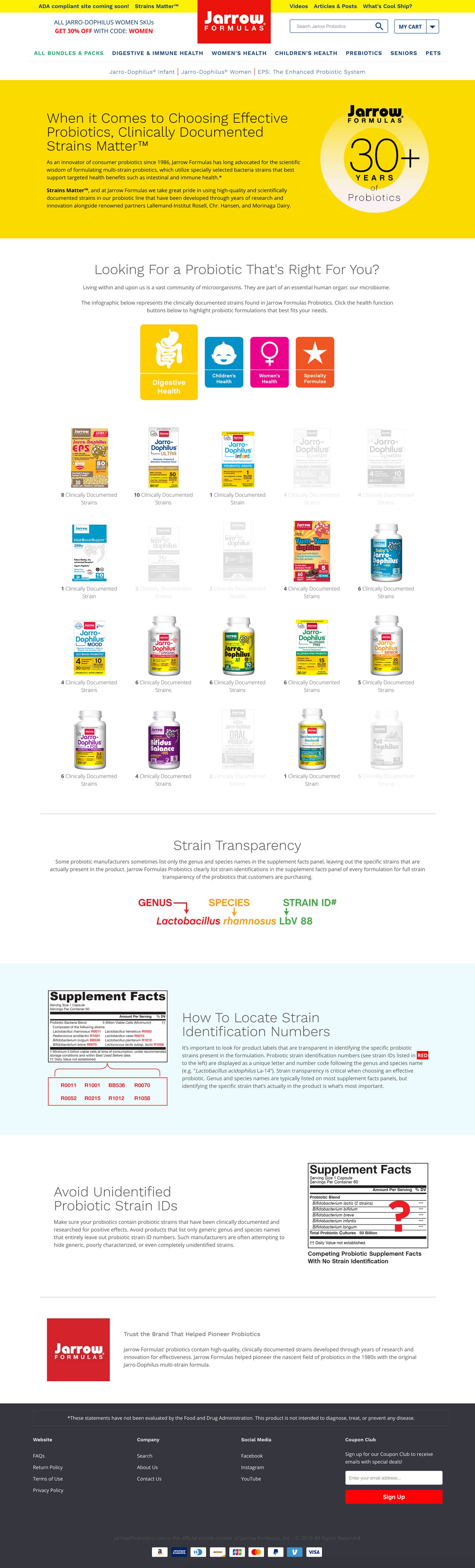
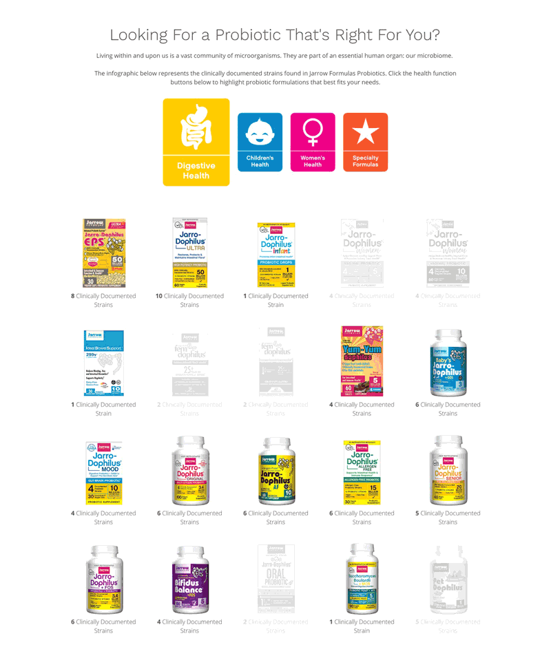
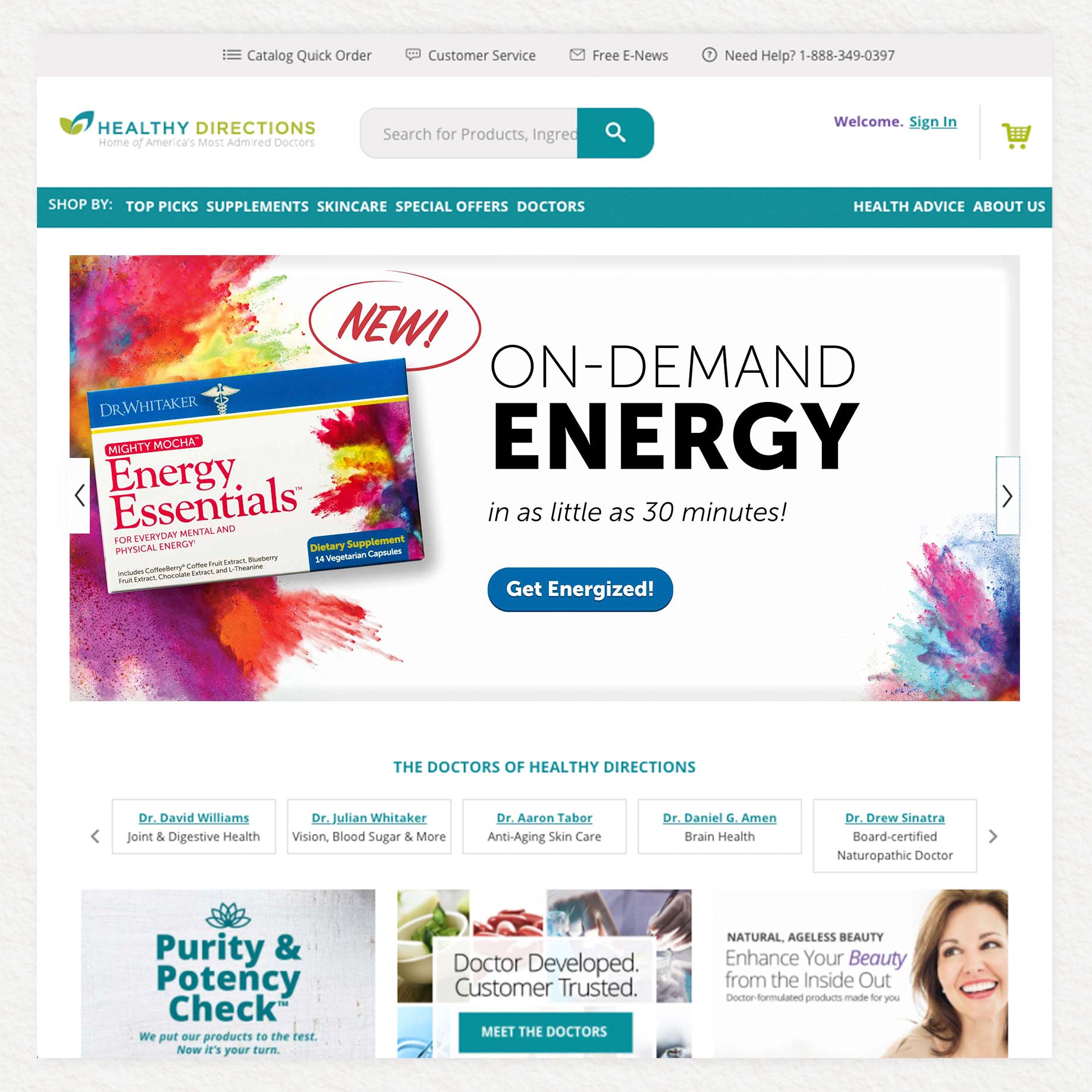
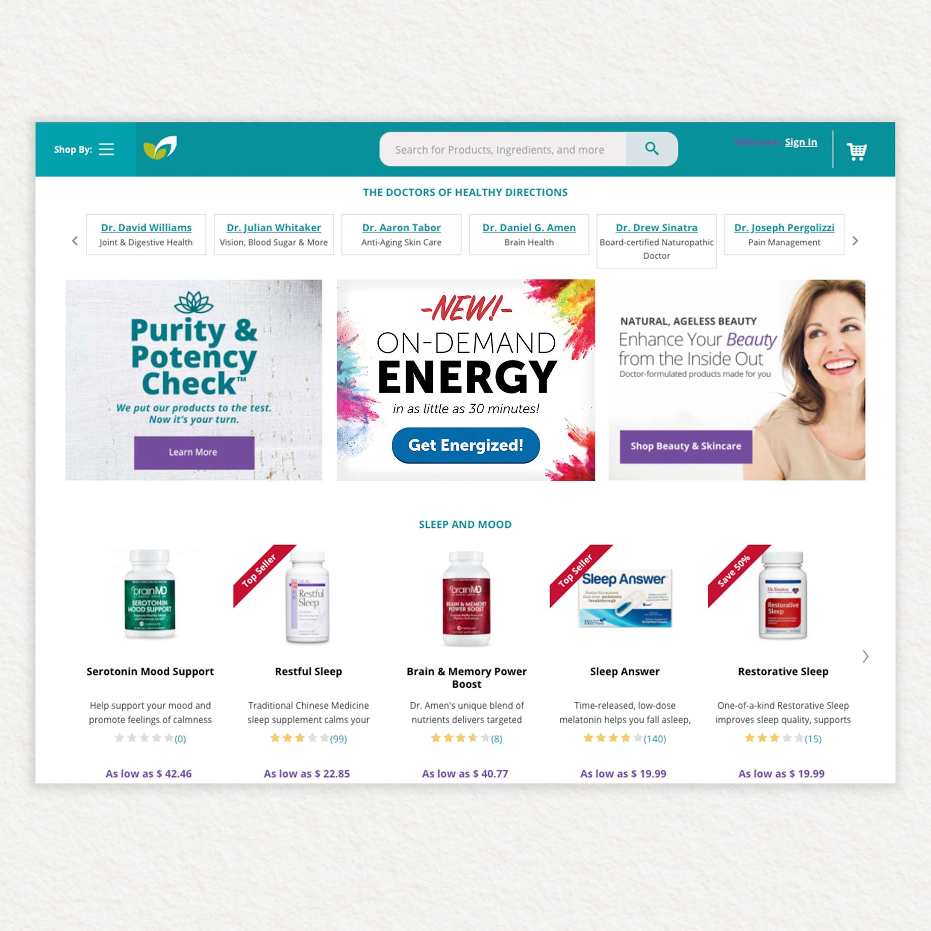
This was a web design and front end development project for Jarrow Formulas’ Probiotics line. I coded the body of these pages with HTML5, CSS3, and Javascript ES6, and formatted them to fit into the custom page area of our Shopify CMS. I also created a framework using CSS Flexbox to ensure site responsiveness on all platforms.
For the Jarrow Formulas Strains Matter page, I created a custom product sorting tool using Vanilla JS and jQuery to help users narrow down their search for a probiotic product by clicking on 1 of 4 possible filters.
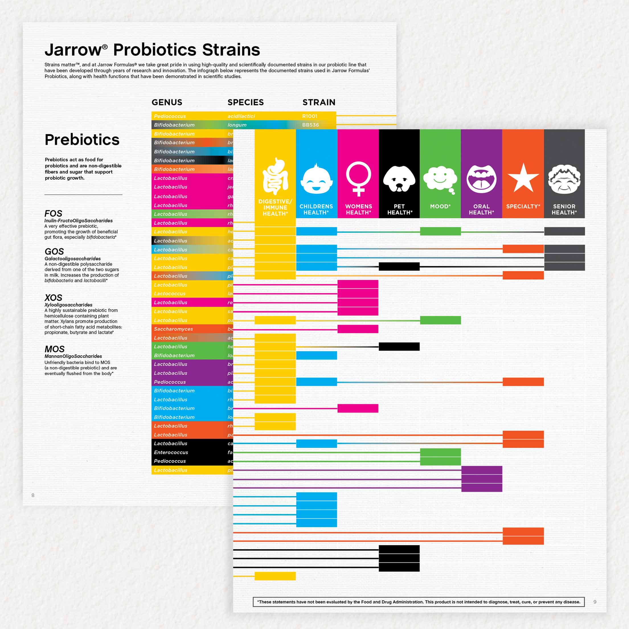
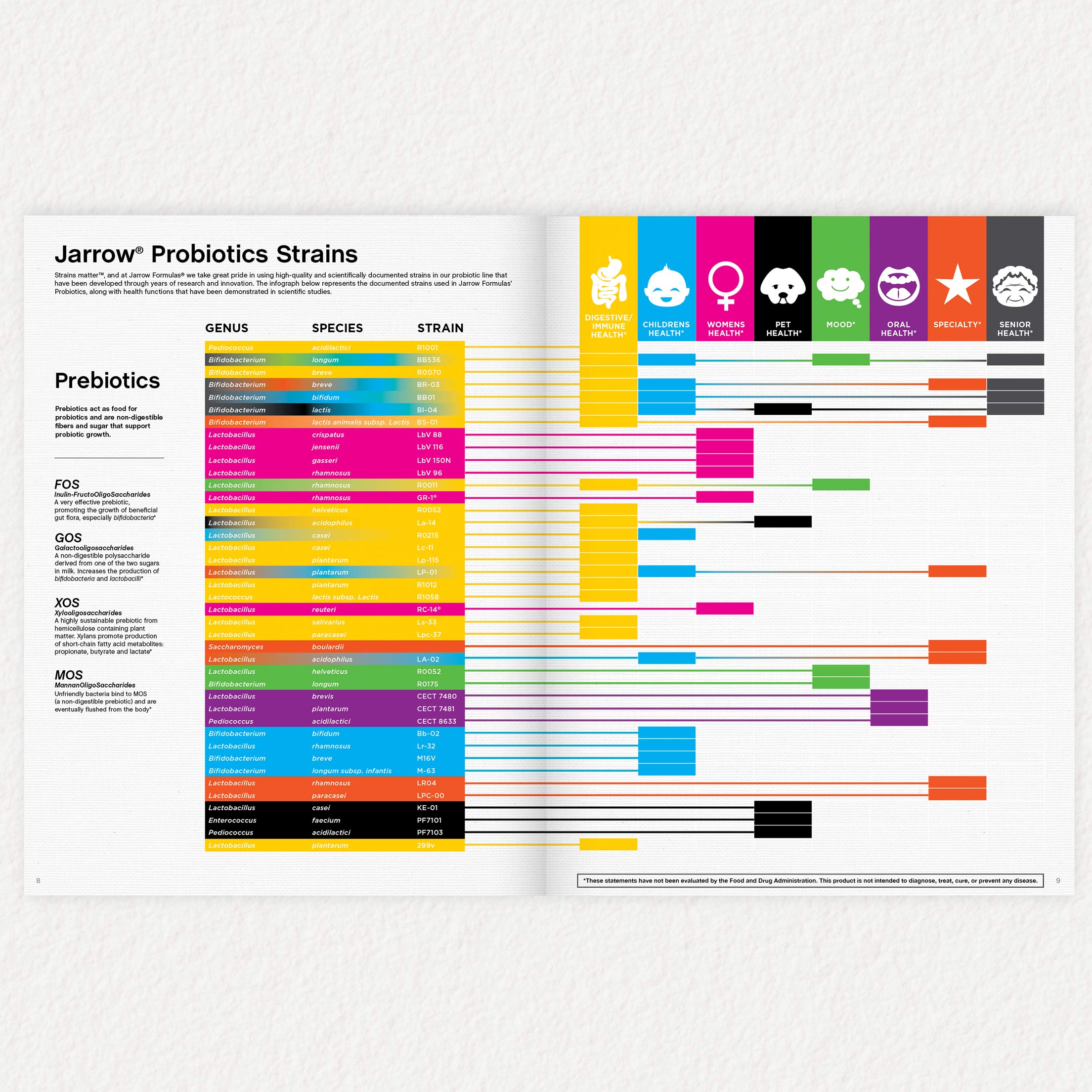
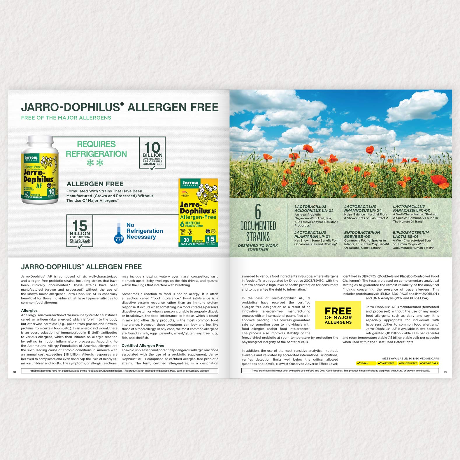
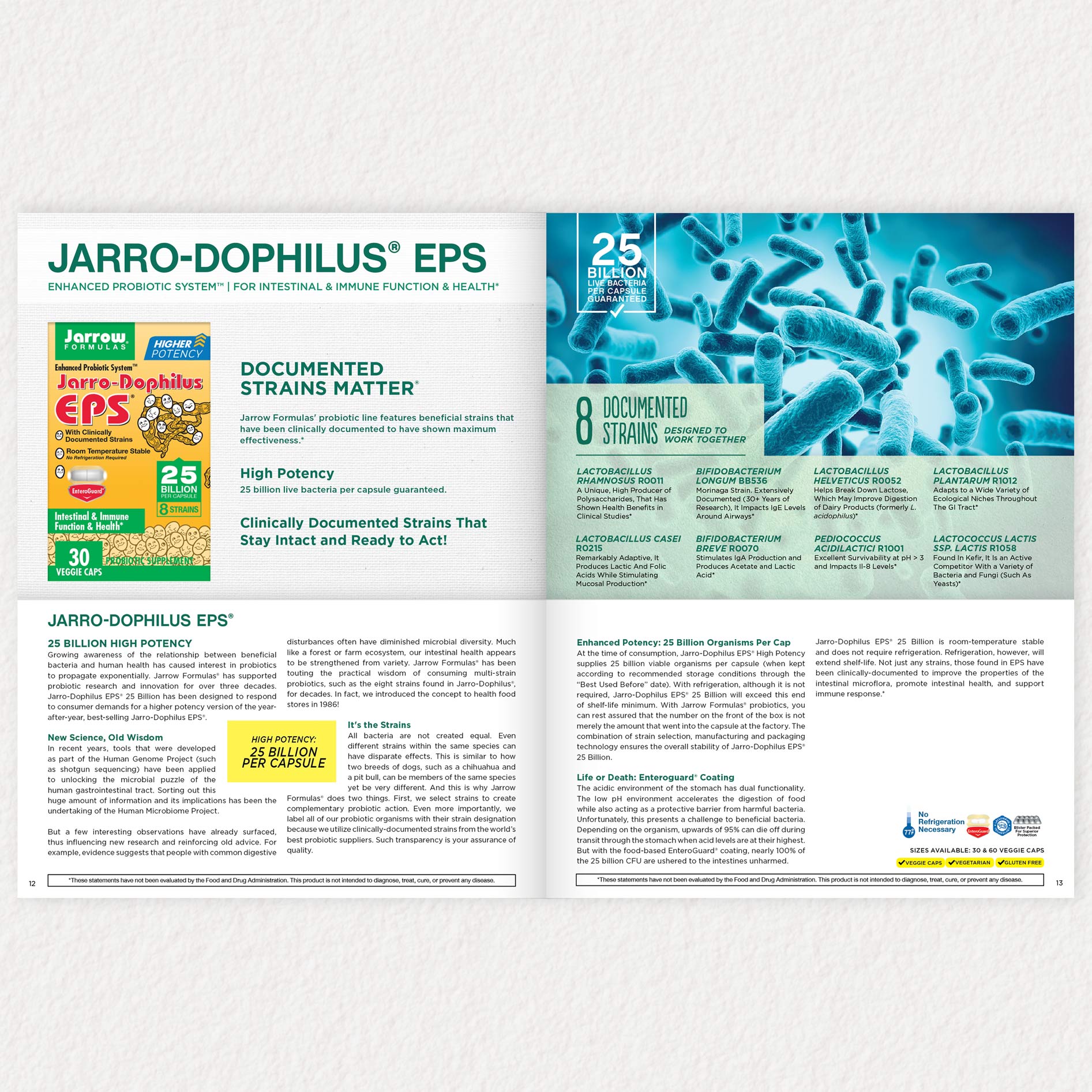
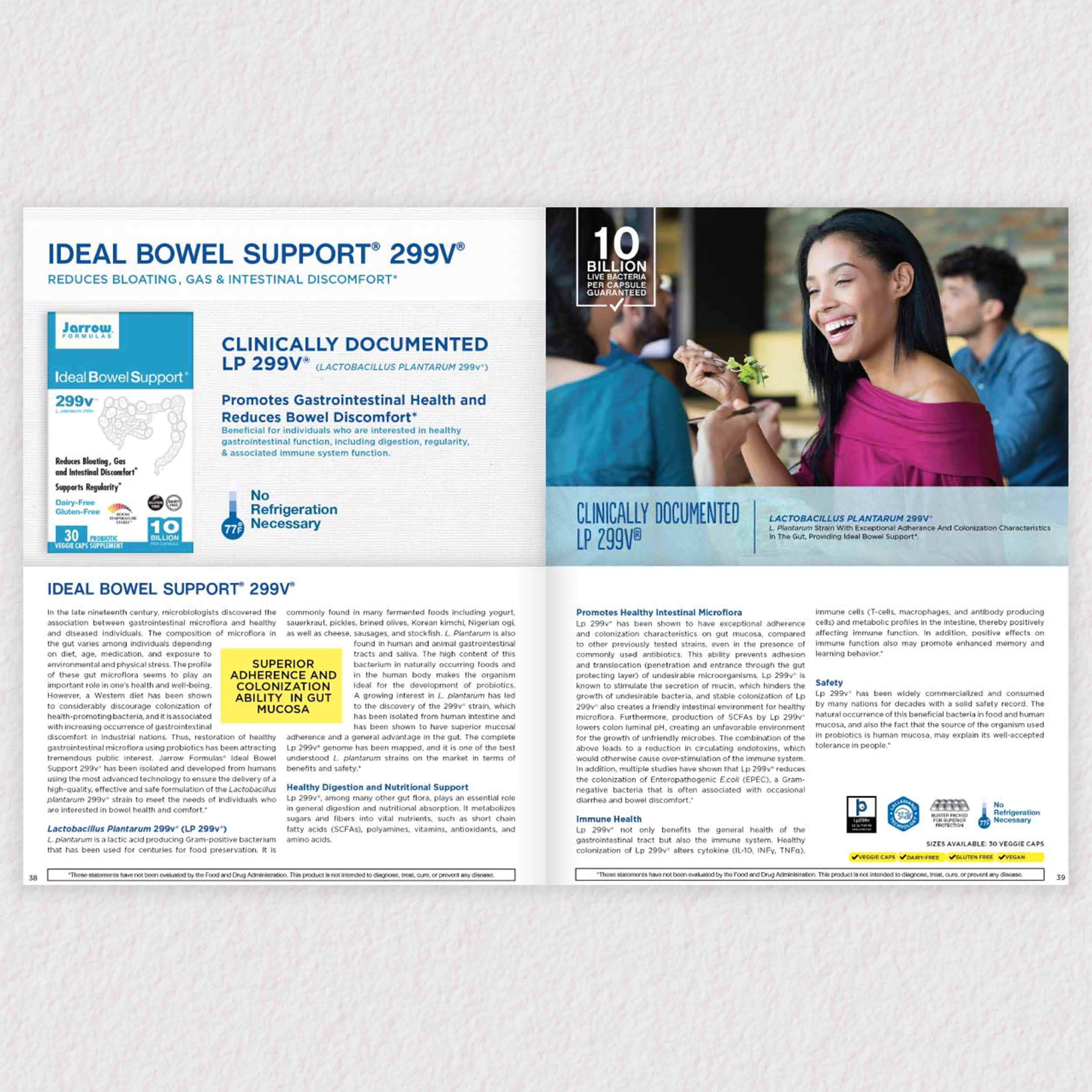
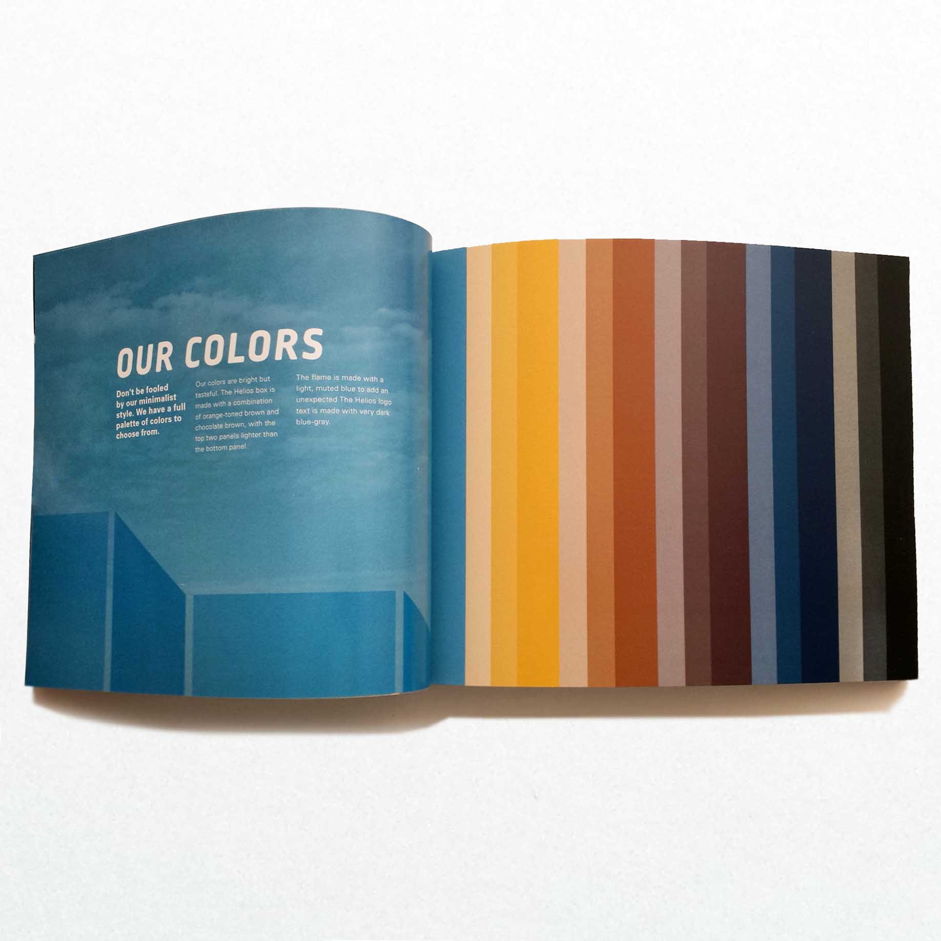
This was an information design and editorial design project for Jarrow Formulas’ new Probiotics book. This long-format informational book details the Jarrow Formulas line of probiotic products in order to market to doctors and consumers. I designed an infographic at the beginning of the book to indicate which complex probiotic strains are associated with certain health topics. This offers a quick reference option to readers who prefer a broader overview of how strains relate to the body.
Along with designing the infographic, I also overhauled the rest of the book to modernize the layout, type treatment, and design scheme.
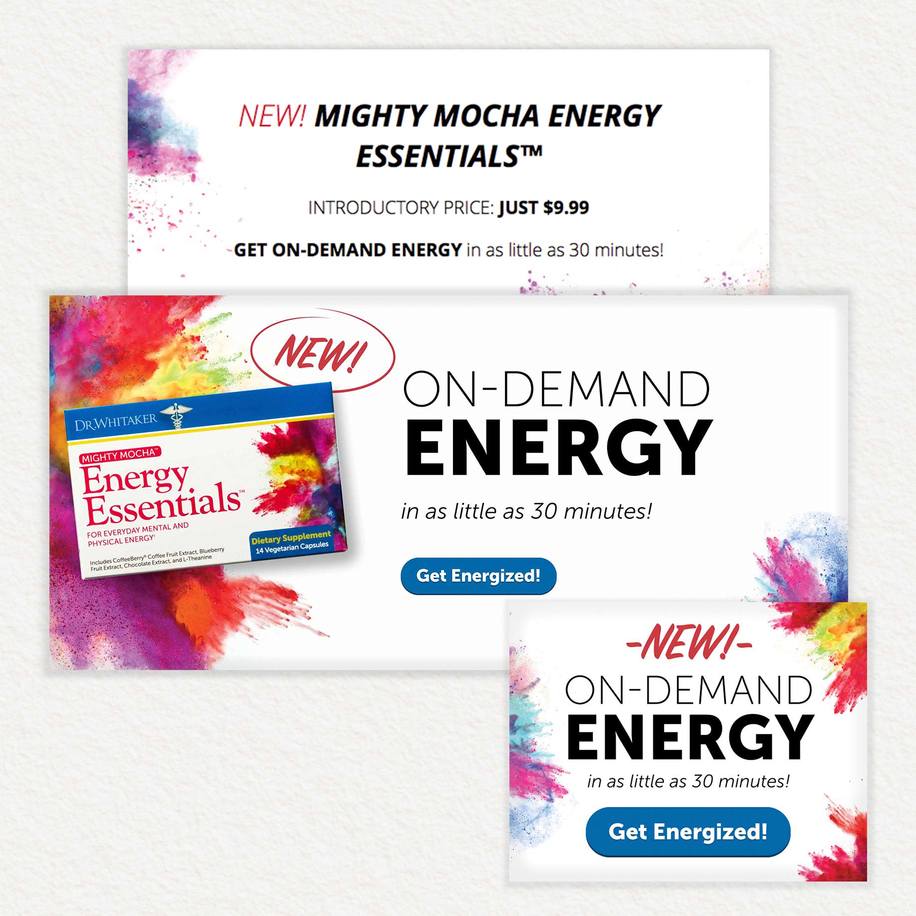
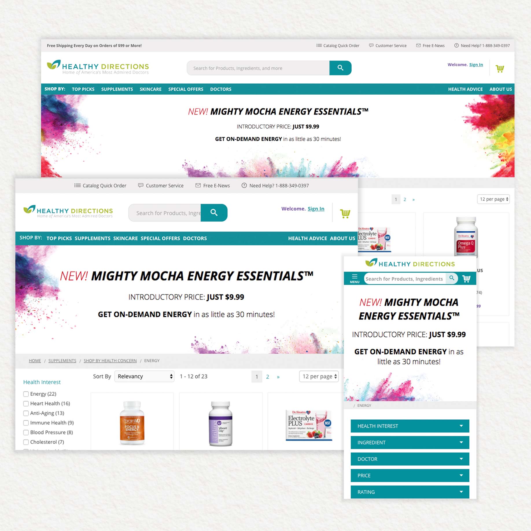
This was a digital design project for Healthy Directions’ Dr. Whitaker health supplement brand. This was used to advertise the release of a new supplement product called Mighty Mocha Energy Essentials. The brand team needed several different banner types for their web advertising initiative: a small callout banner, a banner to use in their site rotators, and a responsive HTML5 coded banner for use at the top of their merchandise pages.
Responsive HTML Banner:
Open Github Repository
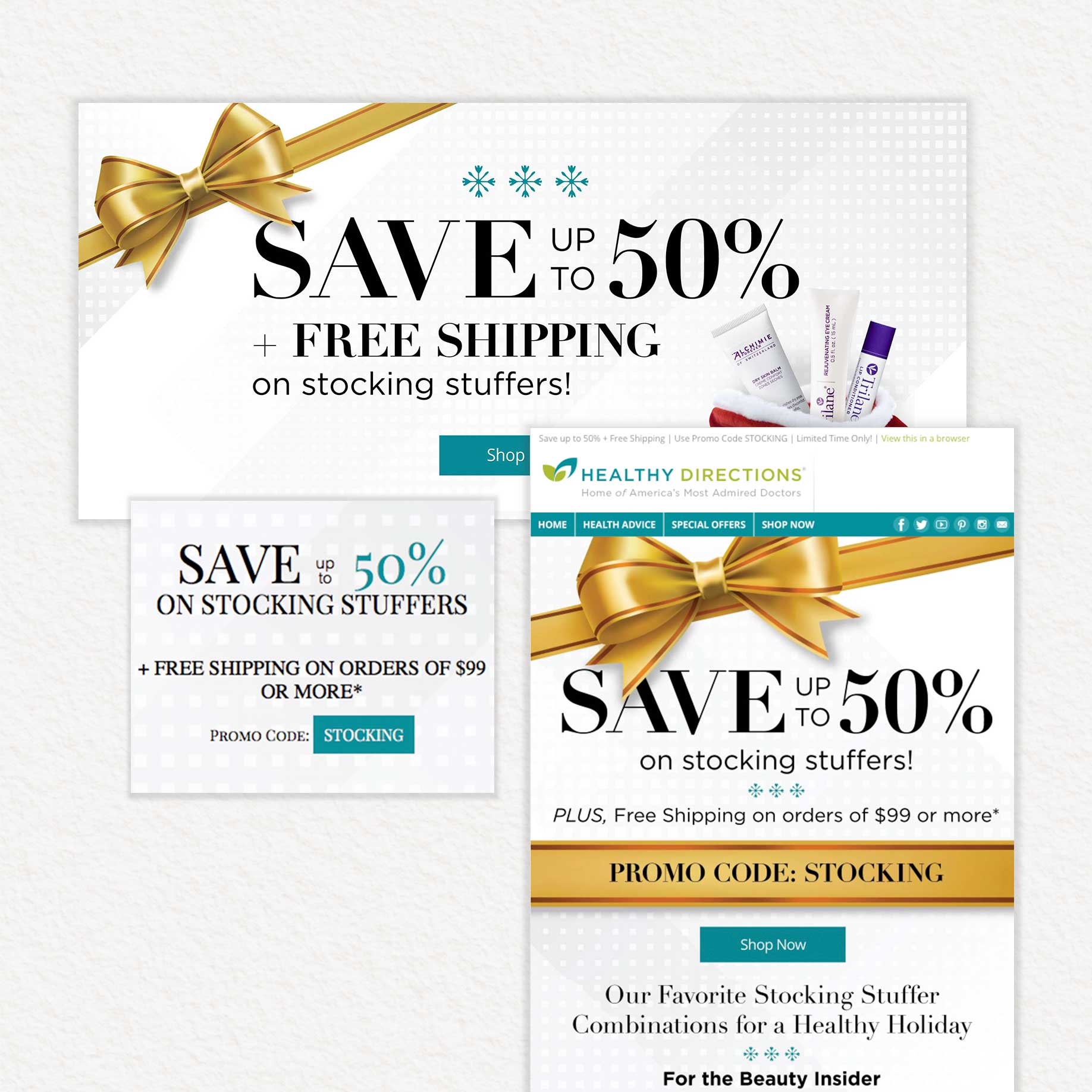
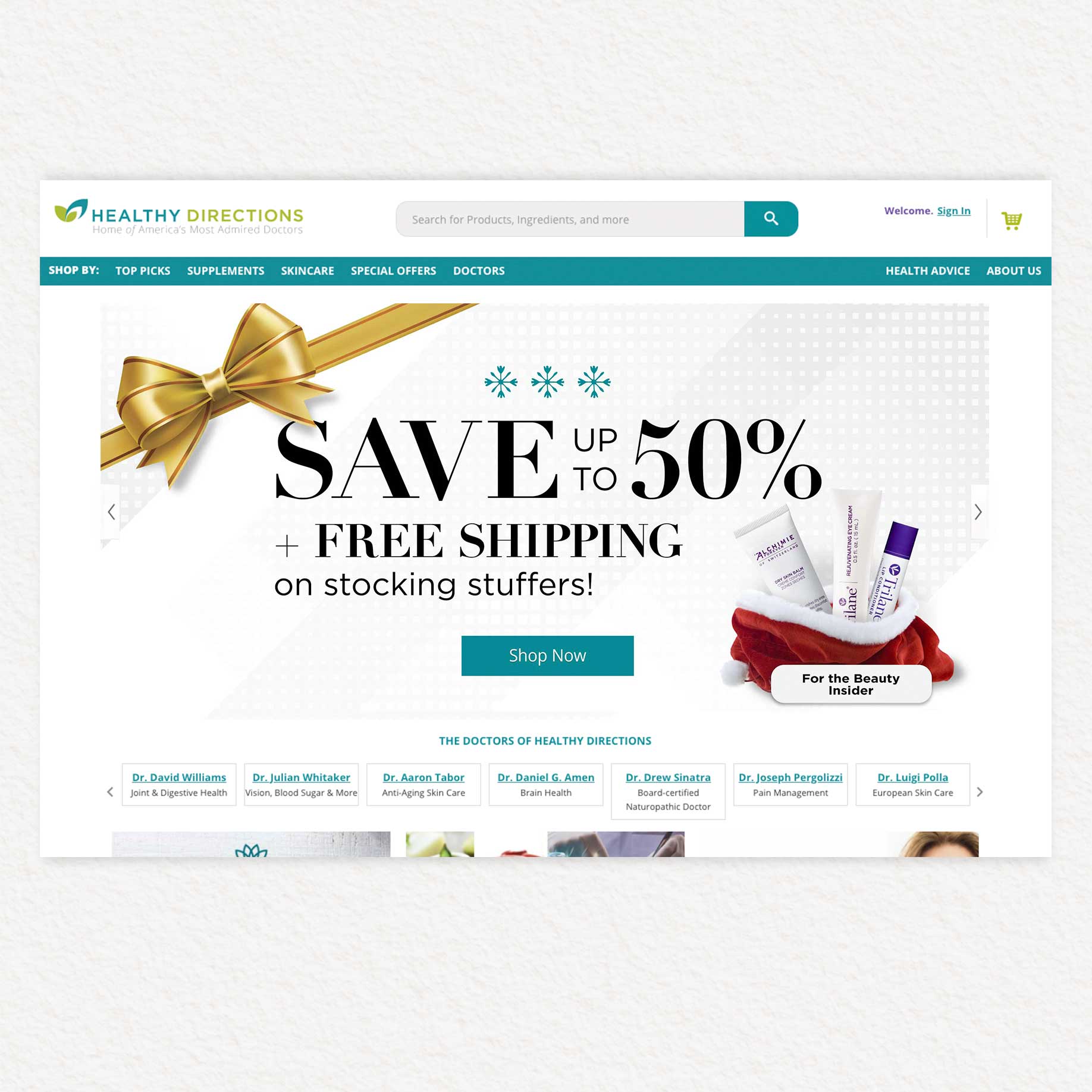
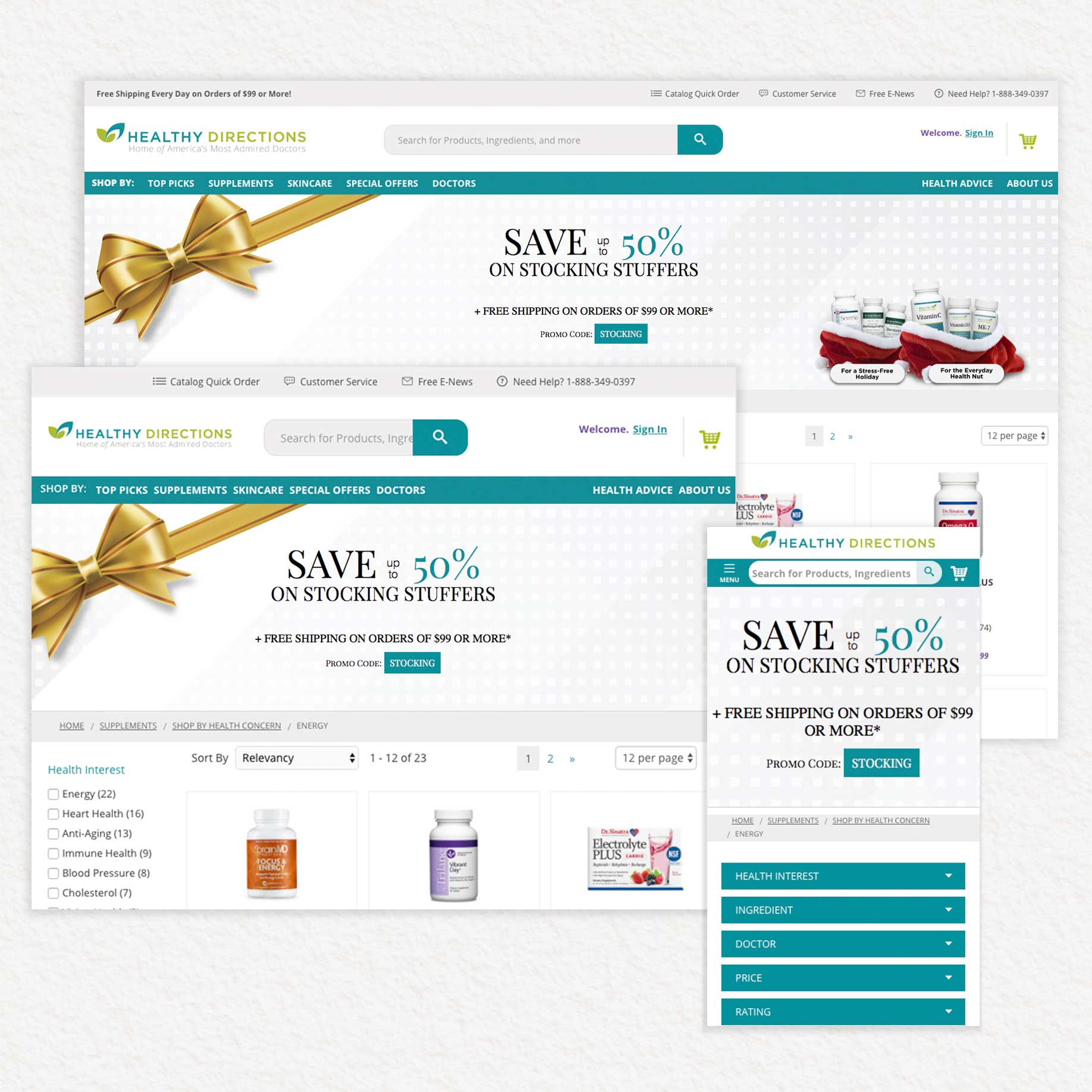
This was an digital and email design project for Healthy Directions’ Christmas Stocking Stuffer sale. This was used to advertise the new bundle-deals for their supplement products. I designed an email, a banner for their site rotator, and a responsive HTML5 banner for their site pages.
Responsive HTML Banner:
Open Github Repository

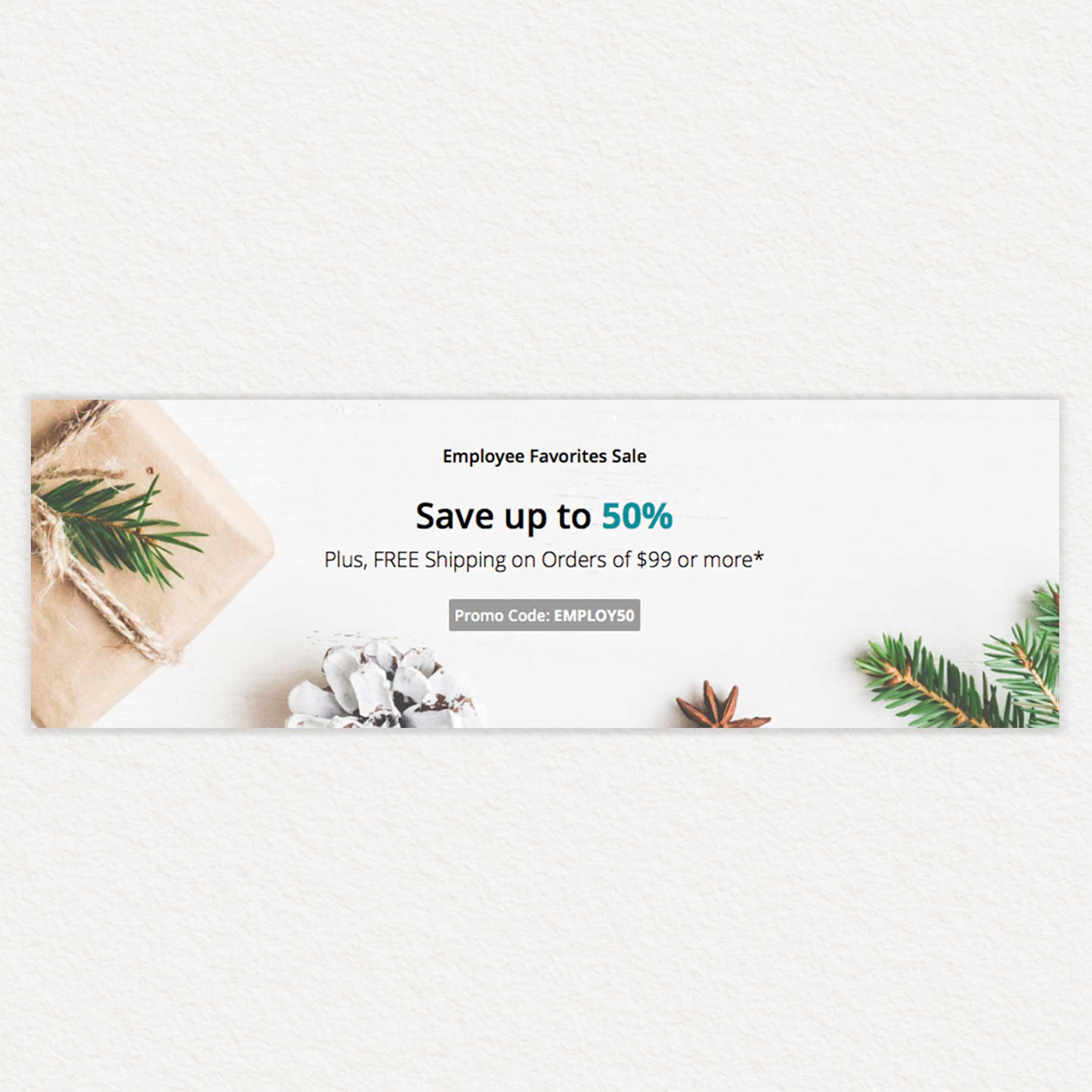
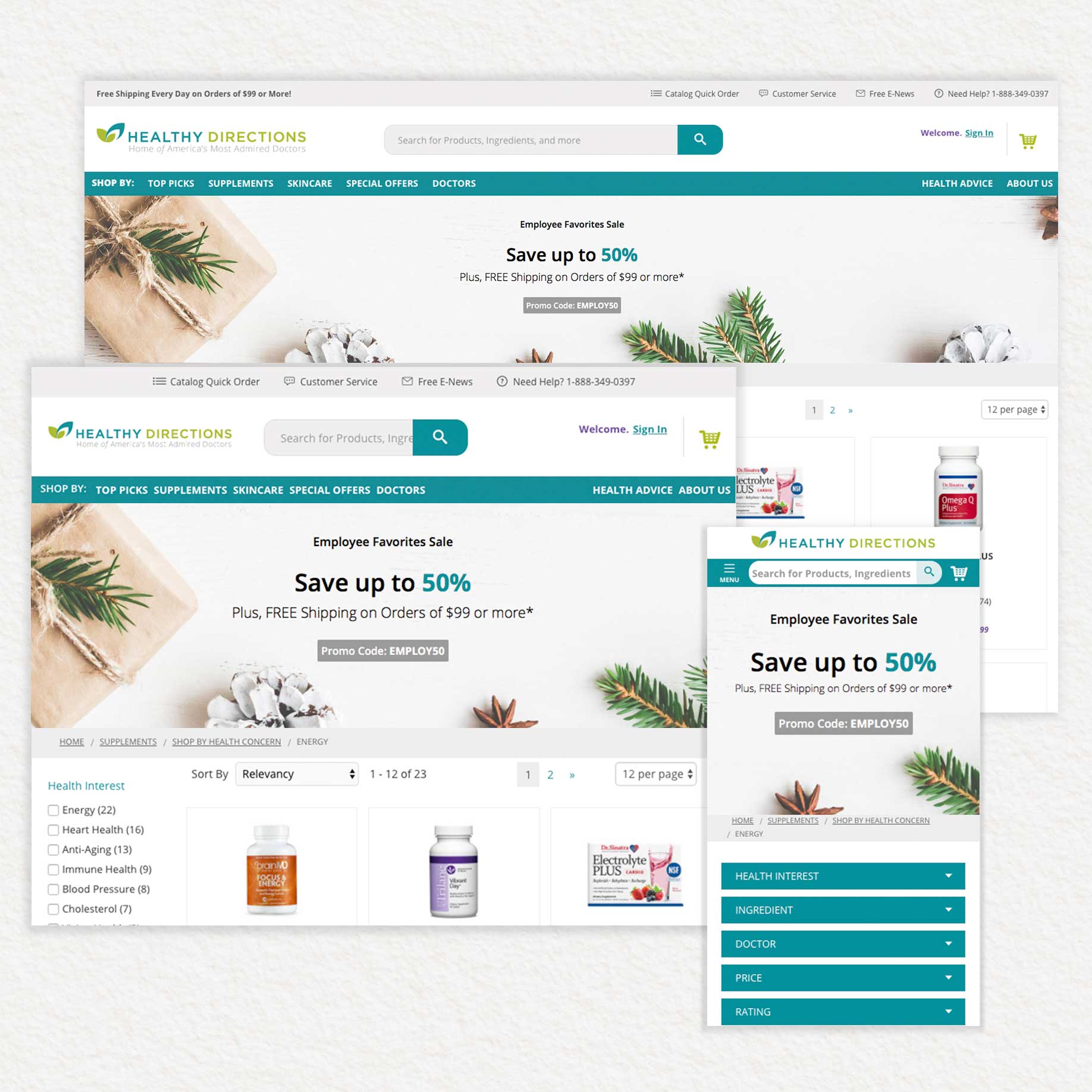
This was a digital design project for Healthy Directions’ Employee Favorites Sale. I designed and coded a responsive HTML5 banner to use at the top of their site pages to advertise their holiday-themed sale.
Responsive HTML5 Banner:
Open Github Repository
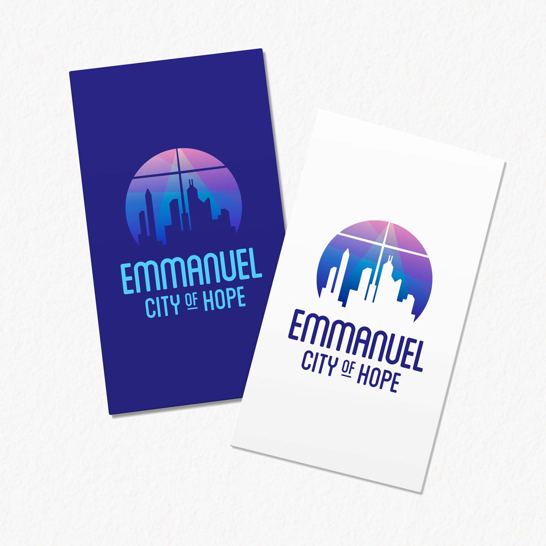
This was a branding project for a newly established ministry in my community. The clients envisioned a modern logo design with subtle religious imagery, and requested that it feature deep pinks and blues.
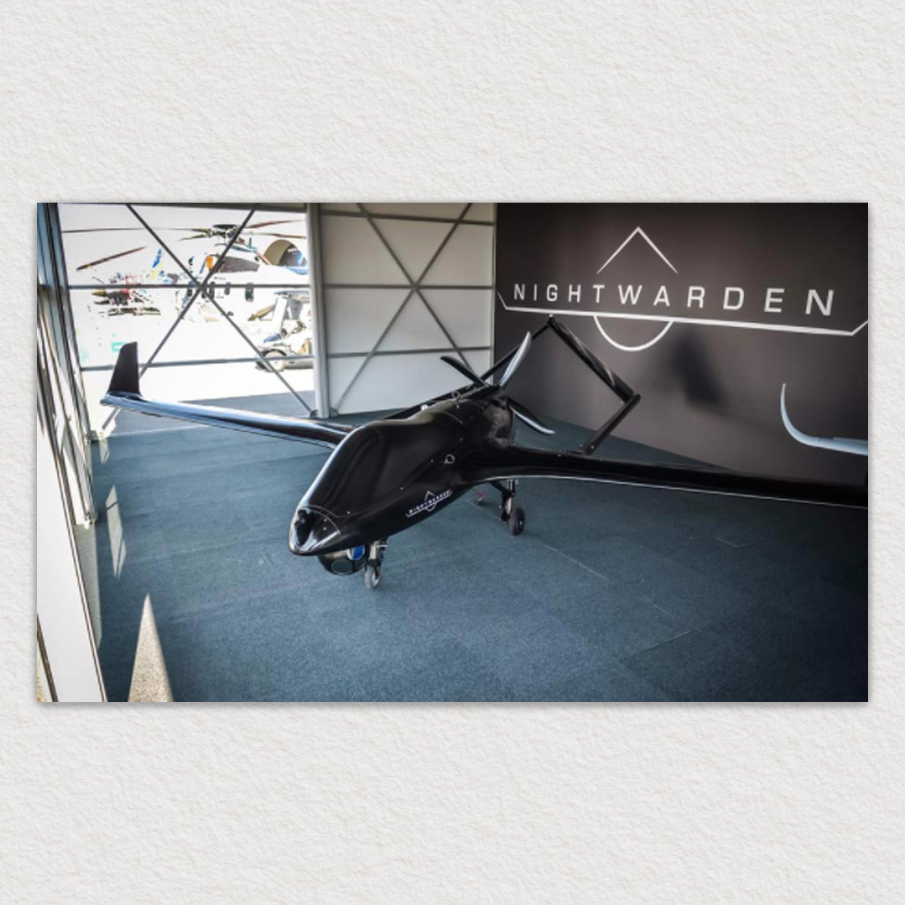
This was a branding project for the Textron Systems - Unmanned Systems marketing department. I designed this logo to celebrate the unveiling of their new unmanned aerial vehicle Nightwarden. I worked with the marketing and manufacturing teams to determine the overall look and theme for the aircraft unveiling and decided on a sleek, dark style. I took my inspiration for the logo from the shapes made by the aircraft when looking at it head on.
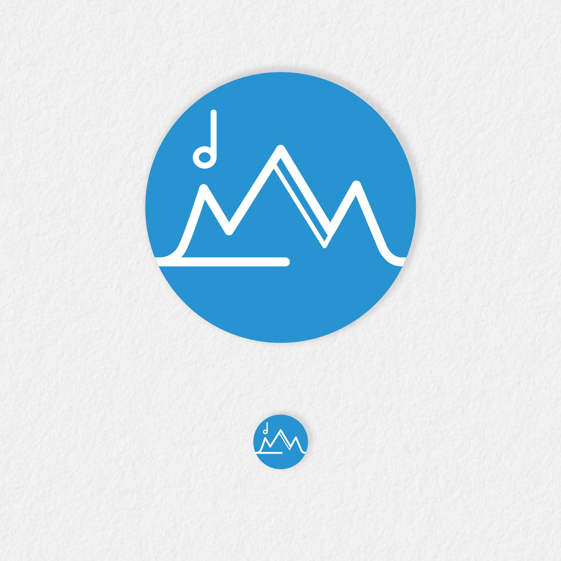
This was a branding project for a developer working on a program called SYNK. The developer wanted to create a solution for synchronizing music and sound effects when playing Dungeons and Dragons online. This way, the Game Master could send out sound bytes or world music to be experienced simultaneously by his players. He wanted a sleek design with custom typography, and a mountain/adventuring theme to tie into the inspiration of DnD. I designed a logo and a favicon for his site, which is currently under construction.
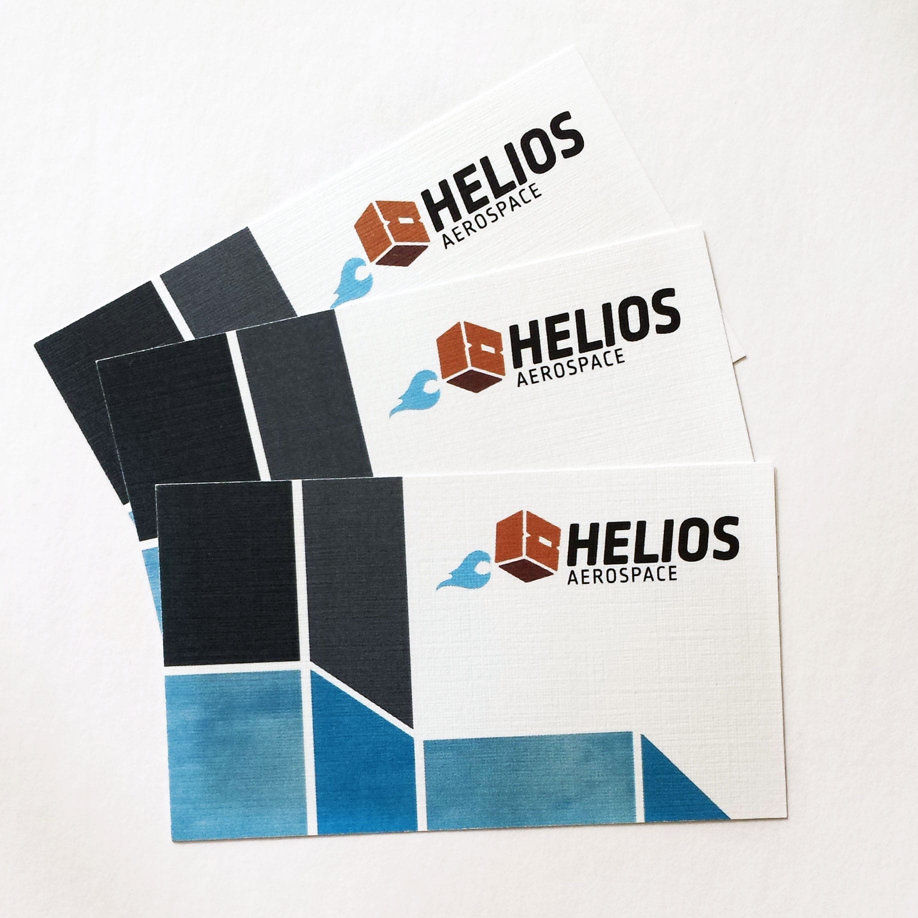
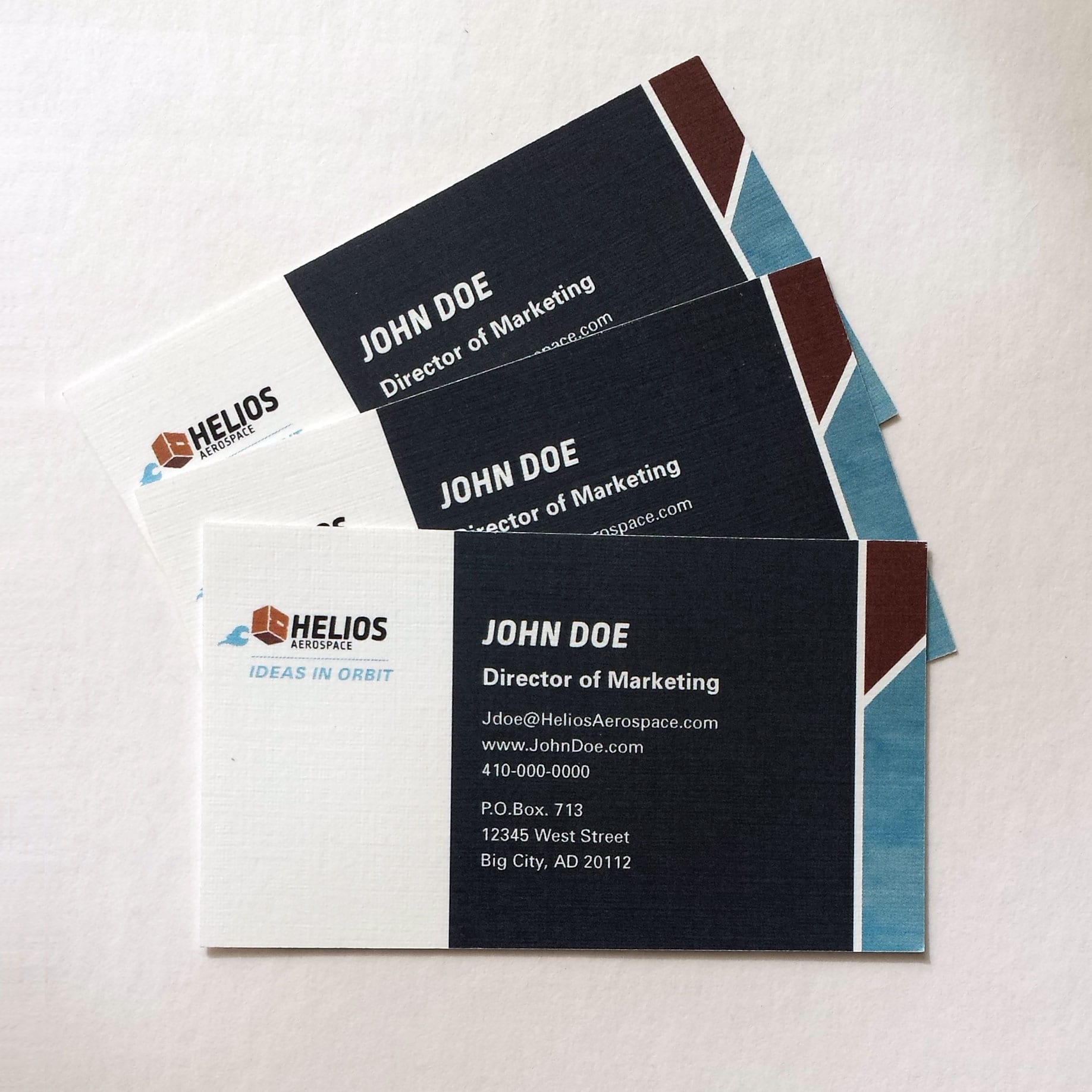
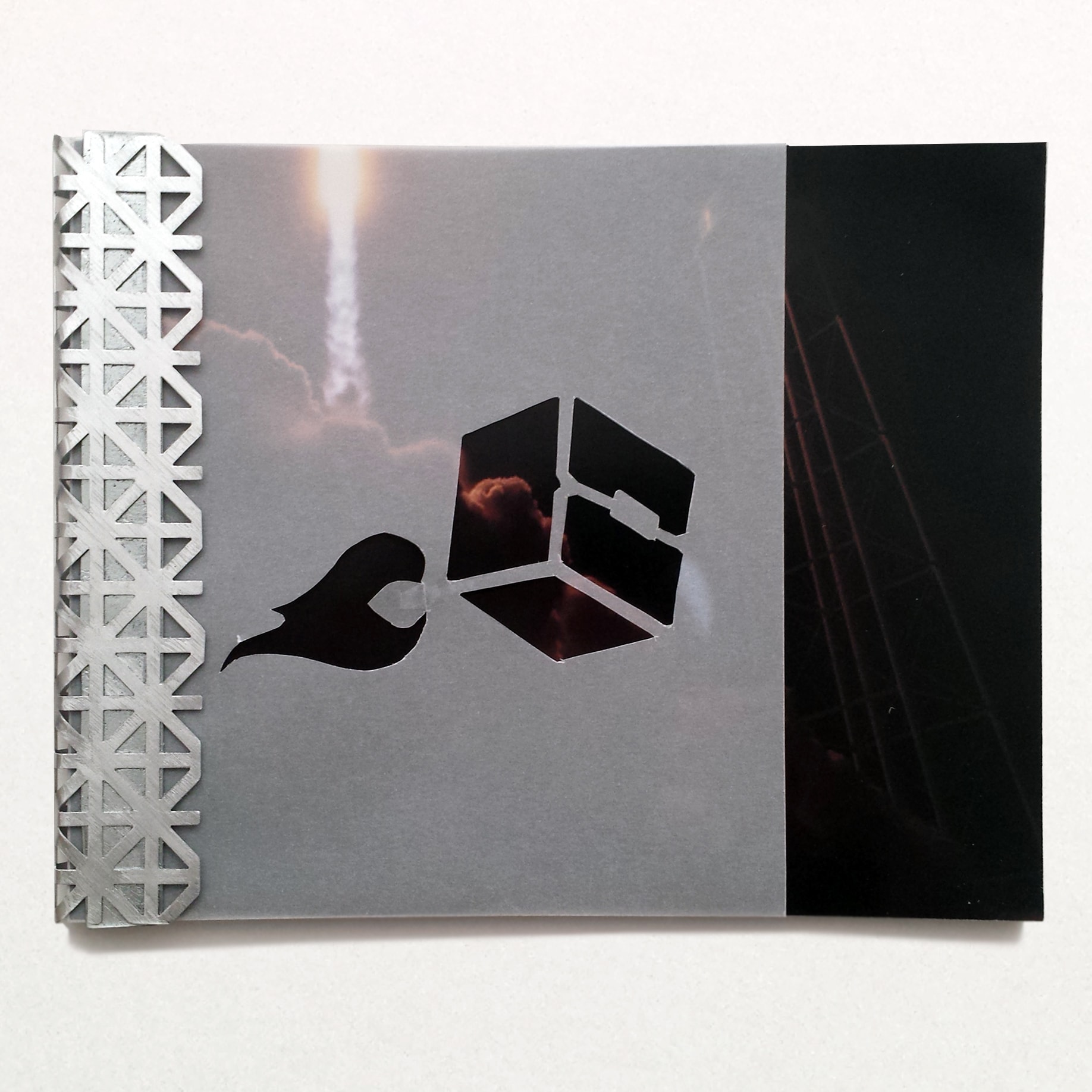
This was a branding and guidebook project for a class at my university. We were given several types of fictional companies to choose from, and were expected to delevop the entire brand for the company we chose. We wrote comprehensive creative briefs and outlined our production schedule for the various deliverables in the project. We then designed a full-scope brand guidebook that detailed every aspect of logo, color, and advertising usage for the company.
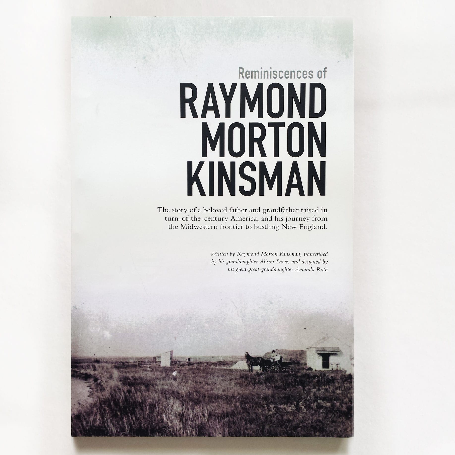
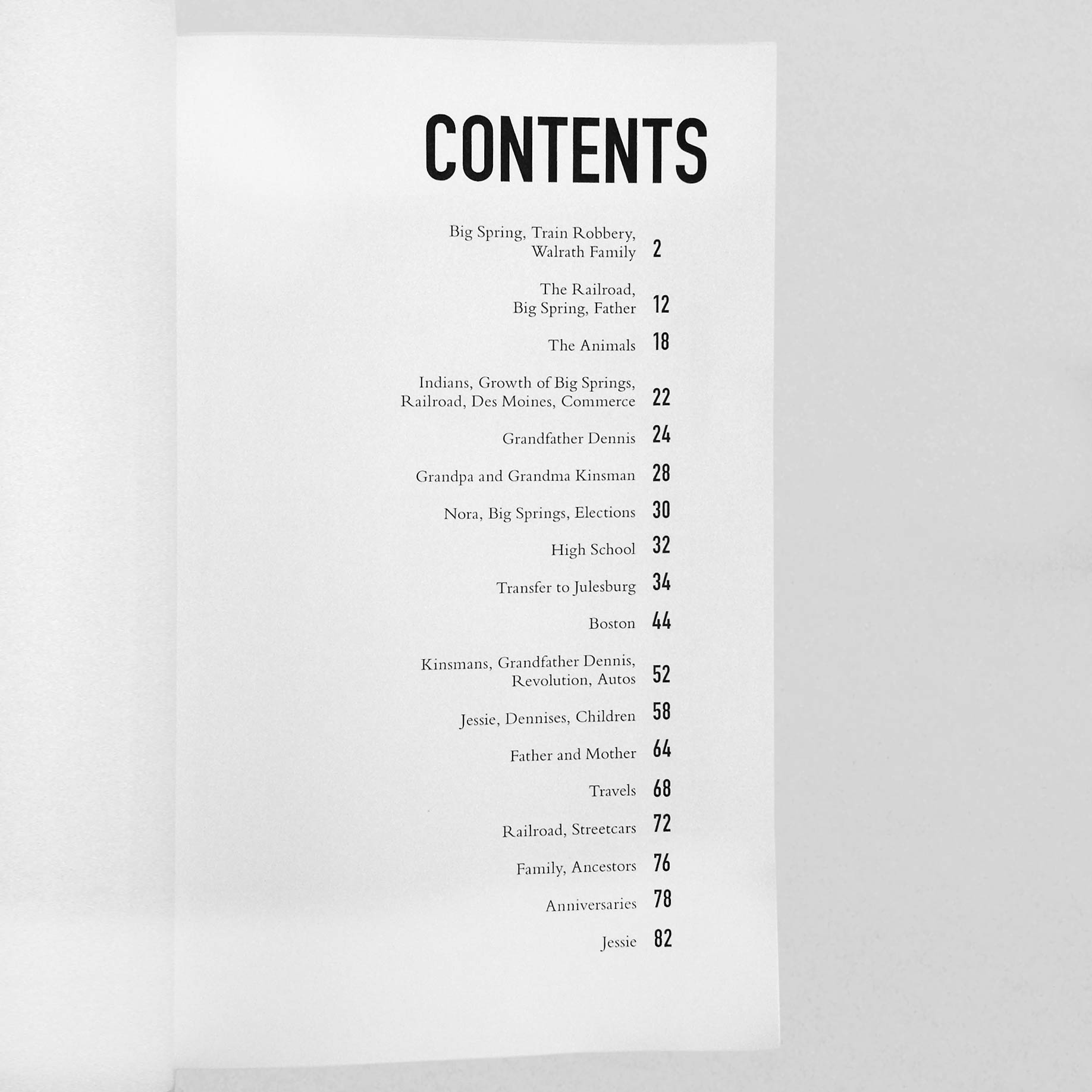
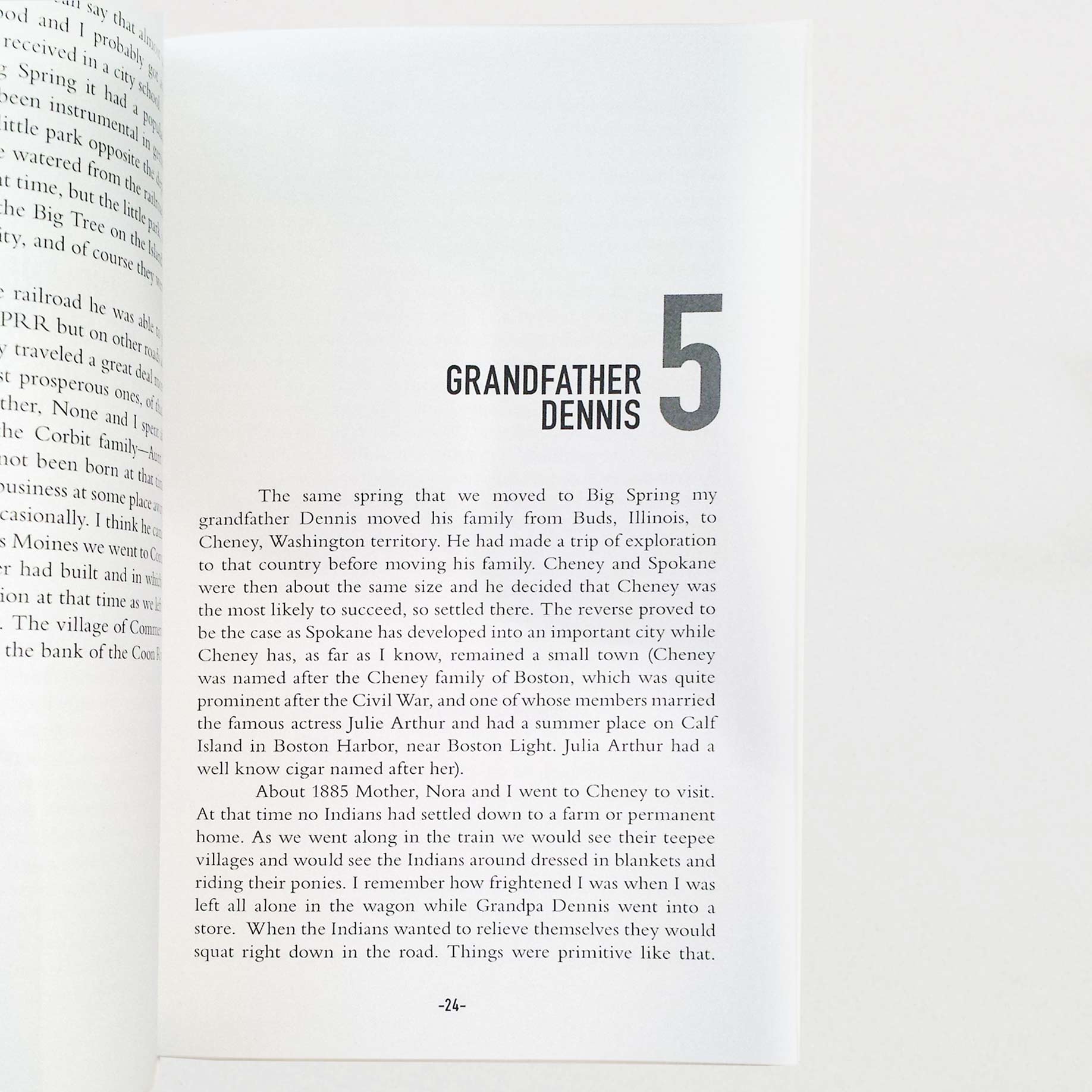
This was an editorial design project for my family. My grandmother found and transcribed the typewritten journals of my great-great grandfather, Raymond Kinsman. This is a comprehensive record of his life, from his childhood on a ranch in Nebraska to his married life on the east coast. The image on the front cover is an actual photo from his records at his ranch out west.
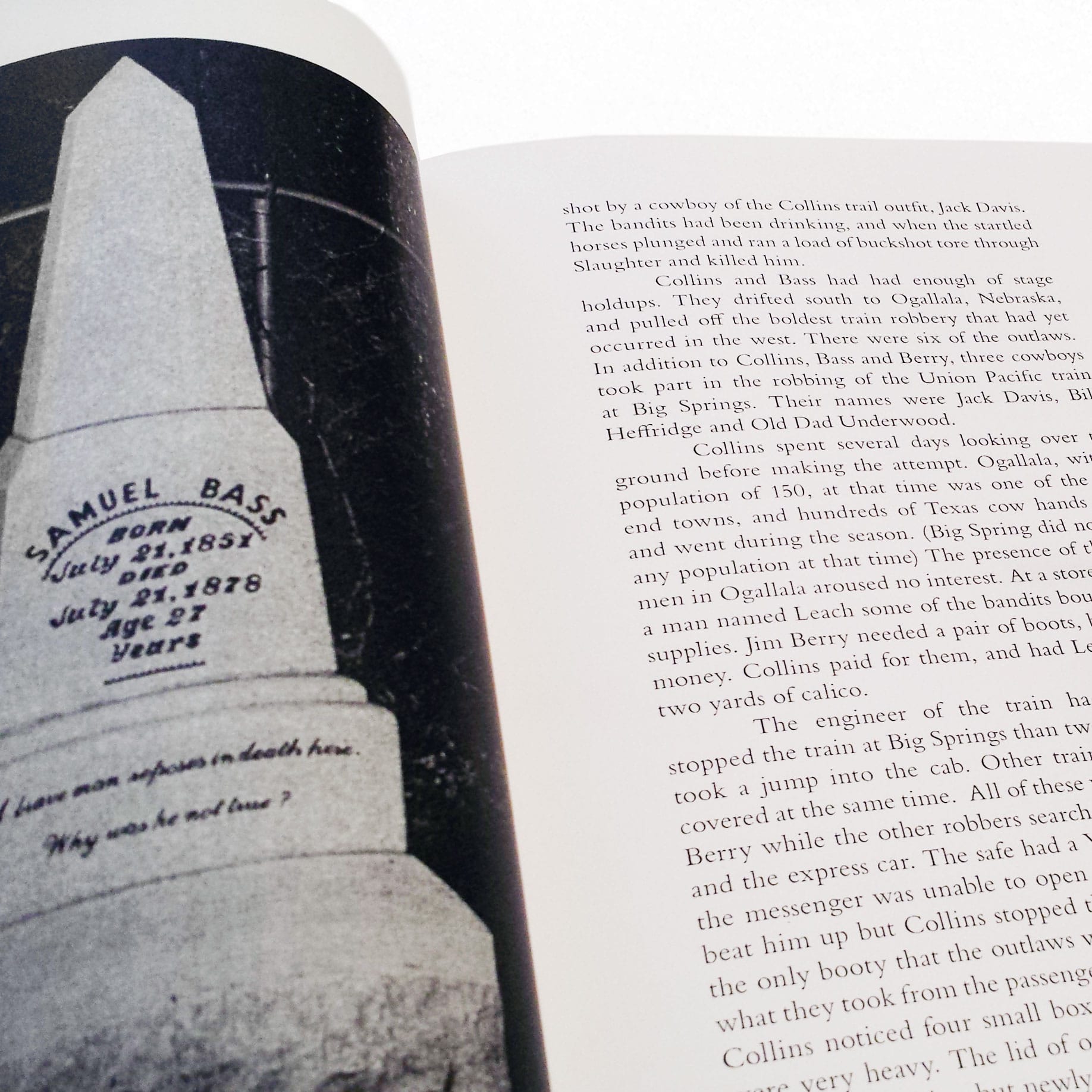
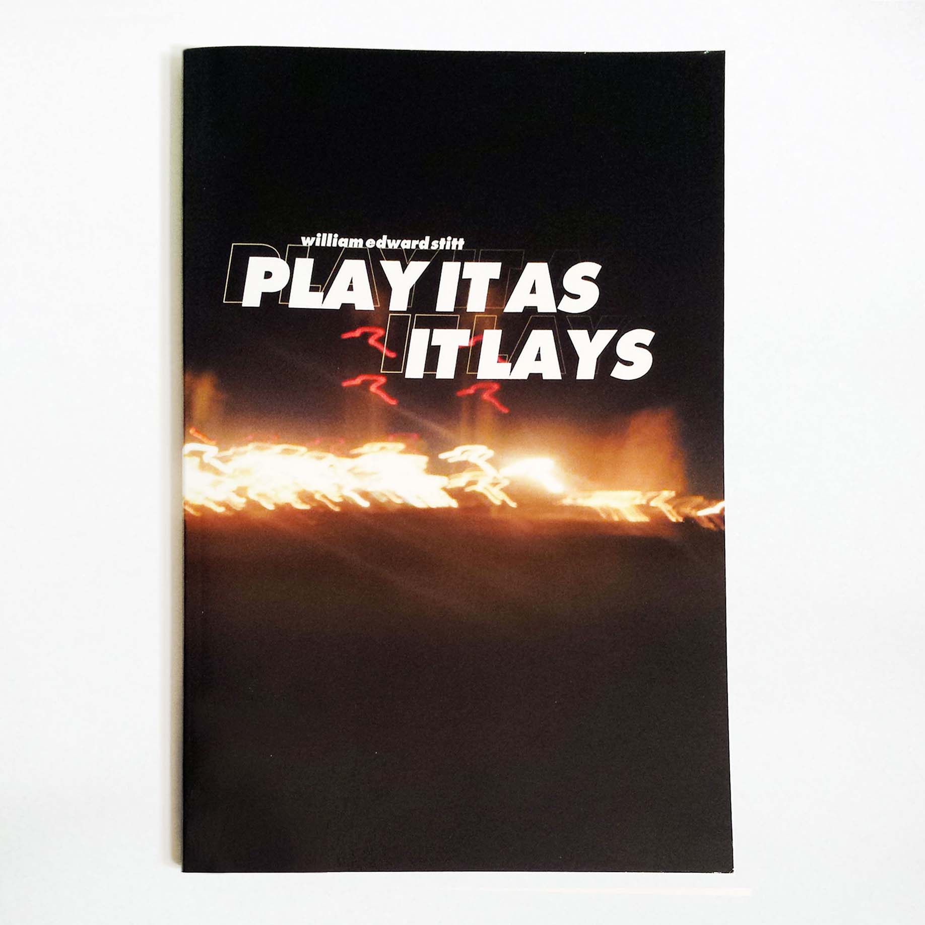
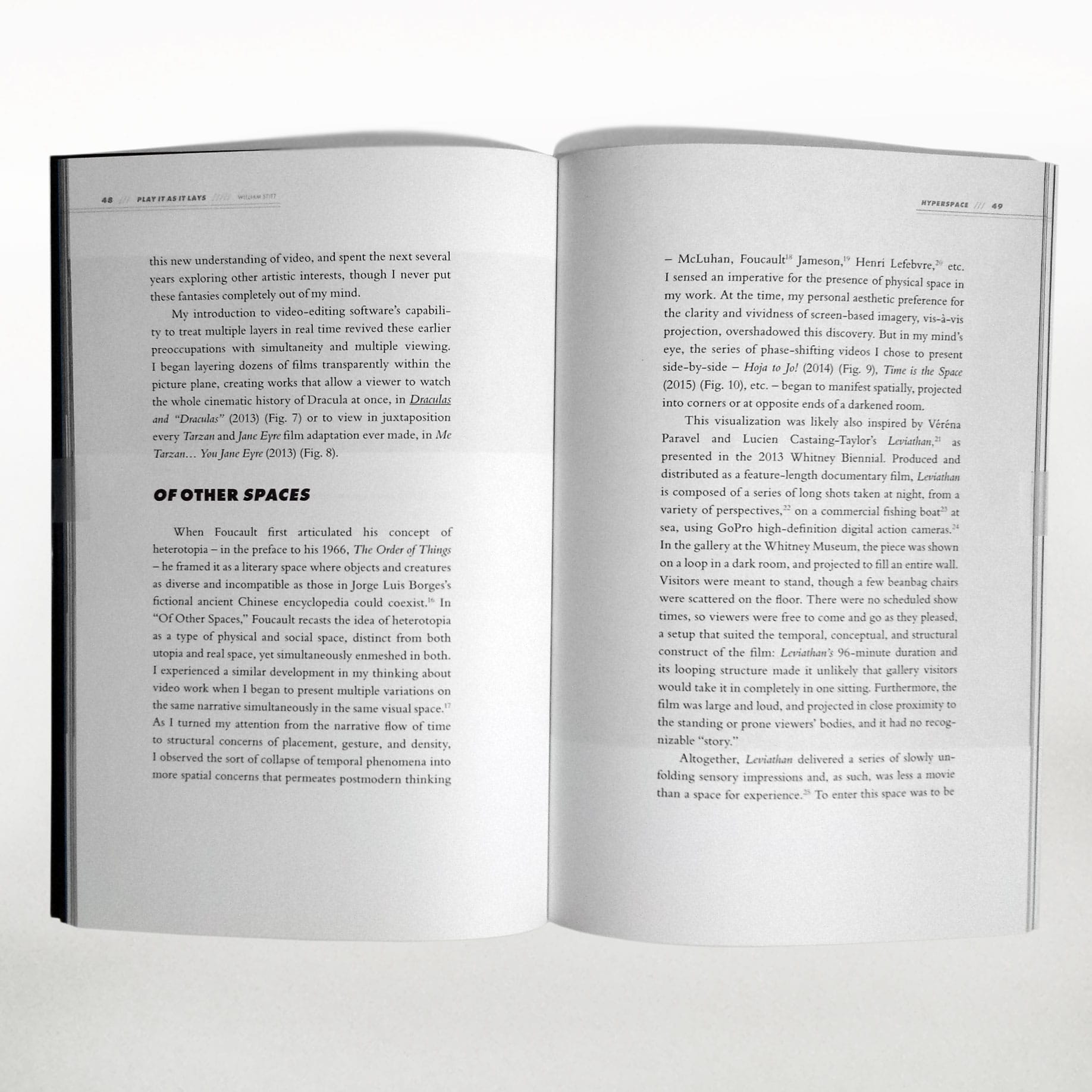
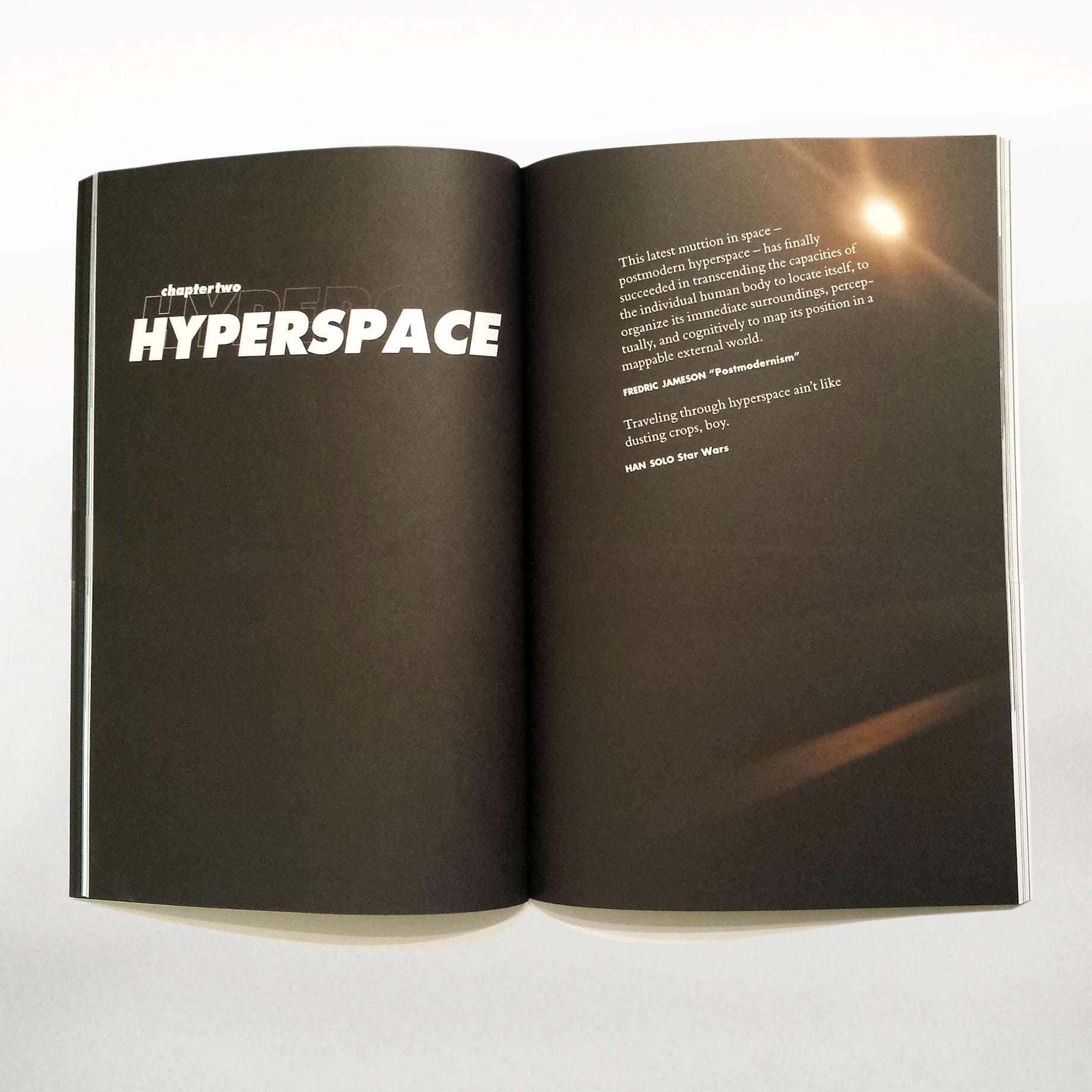
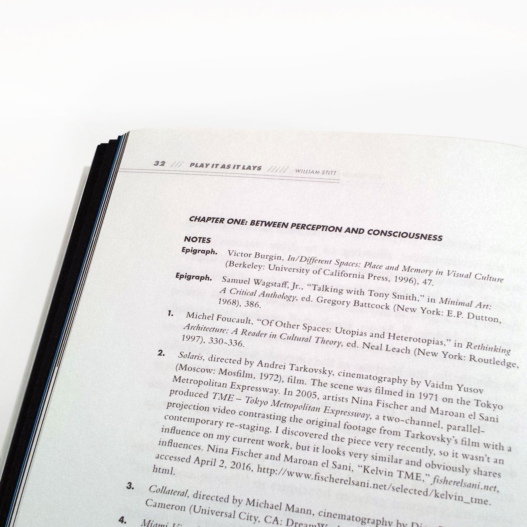
This was an editorial design project for the Imaging and Digital Arts graduate students at my university. I worked with William Edward Stitt to typeset his Masters thesis and exhibition art into the book "Play It As It Lays". It was a privilege to design for Stitt and to be able to represent his work in editorial form.
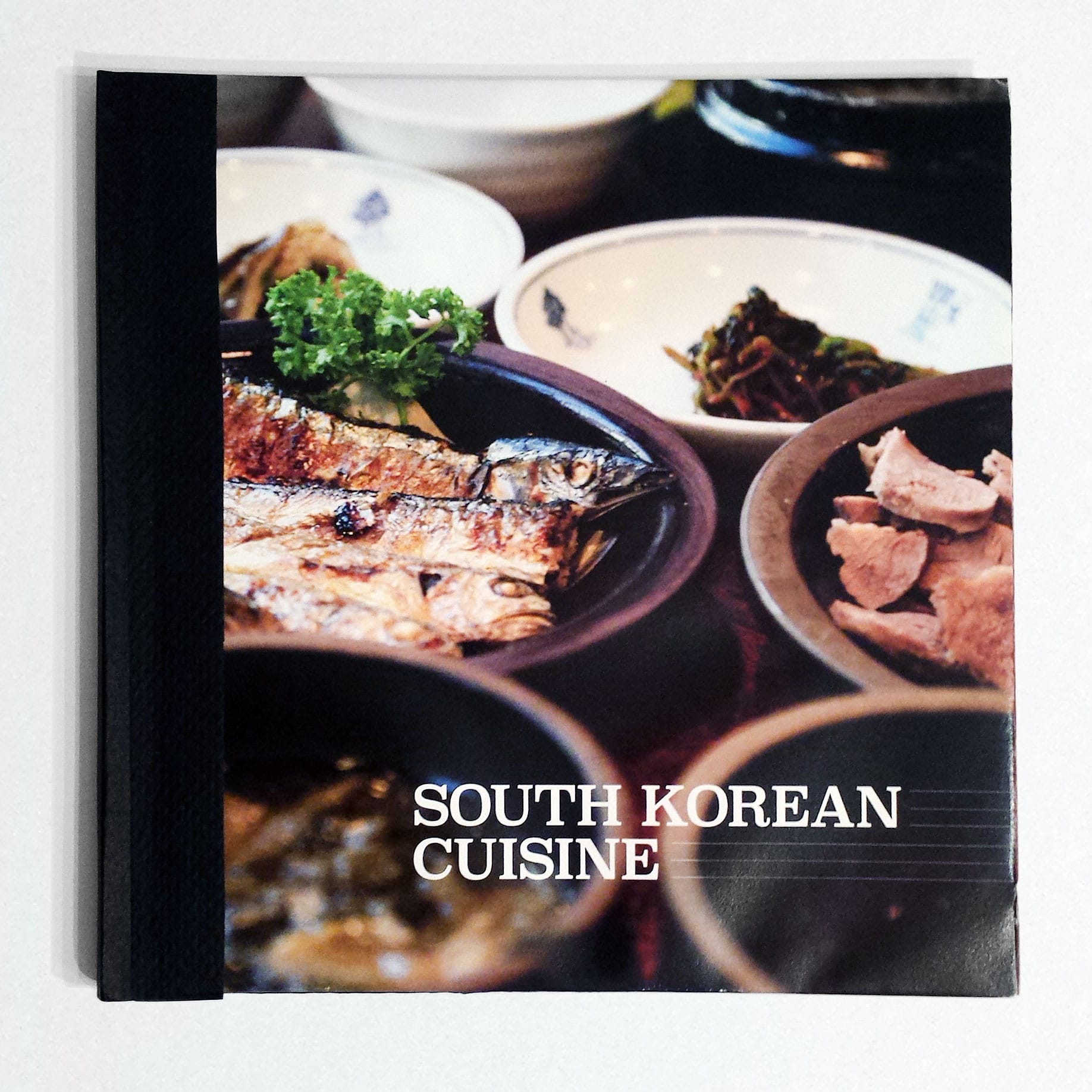
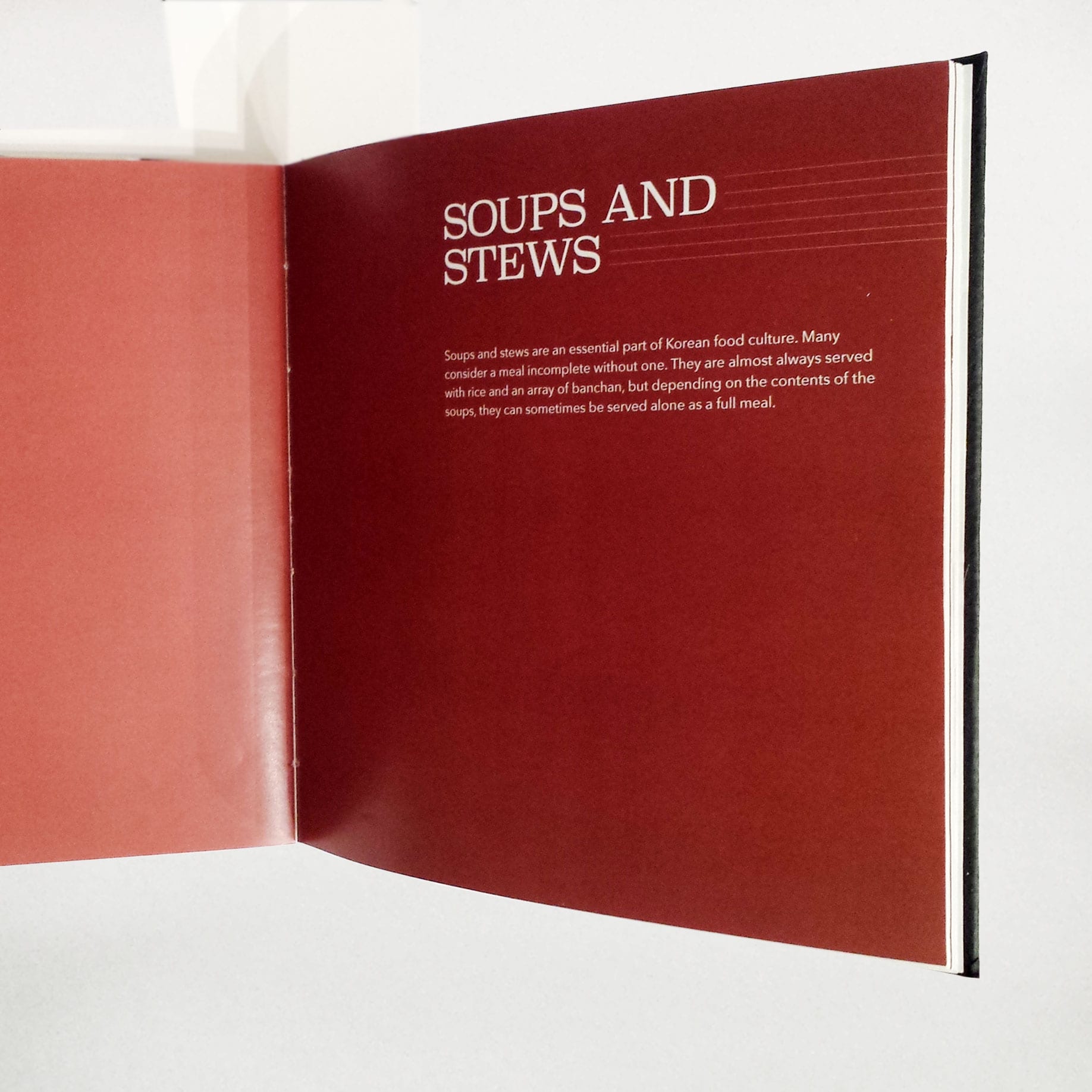
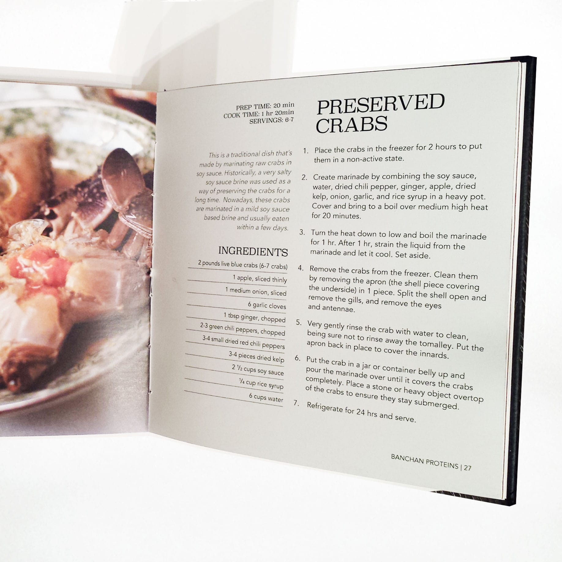
This was a layout and typography project for a class at my university. We were instructed to design a cookbook based on a national or regional cuisine of our choosing. We then needed to choose the typefaces, informational layout, size, and binding method for our cookbooks.
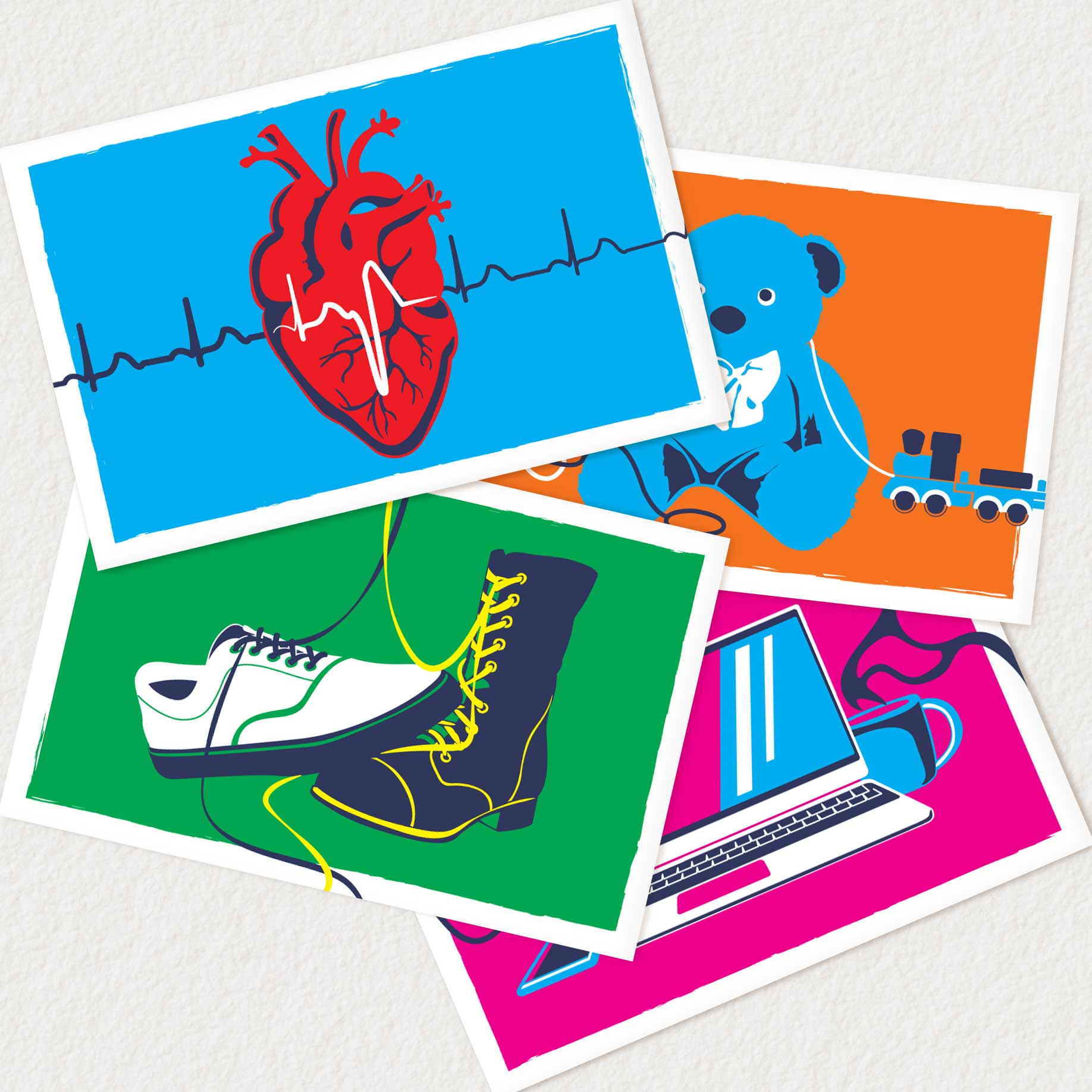
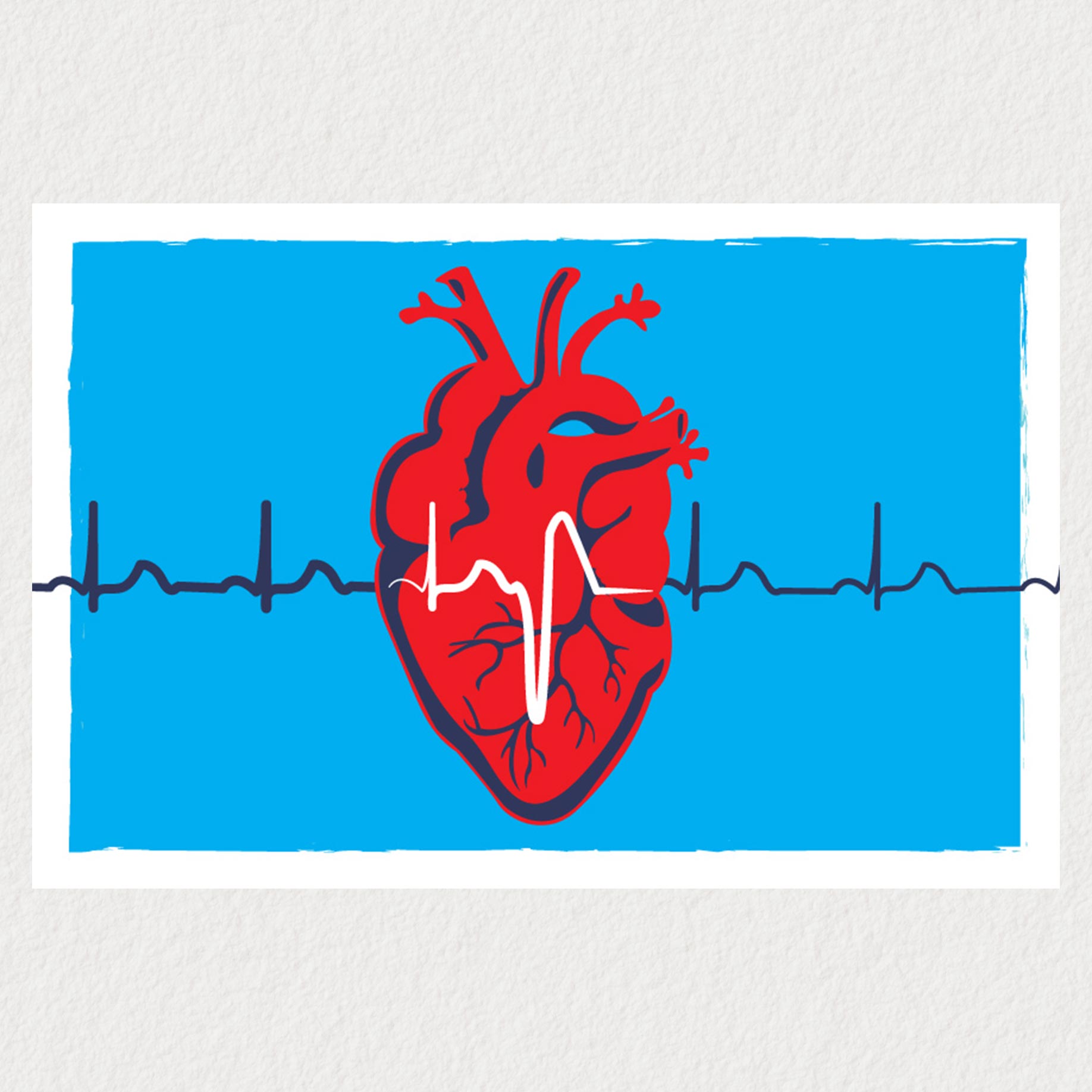
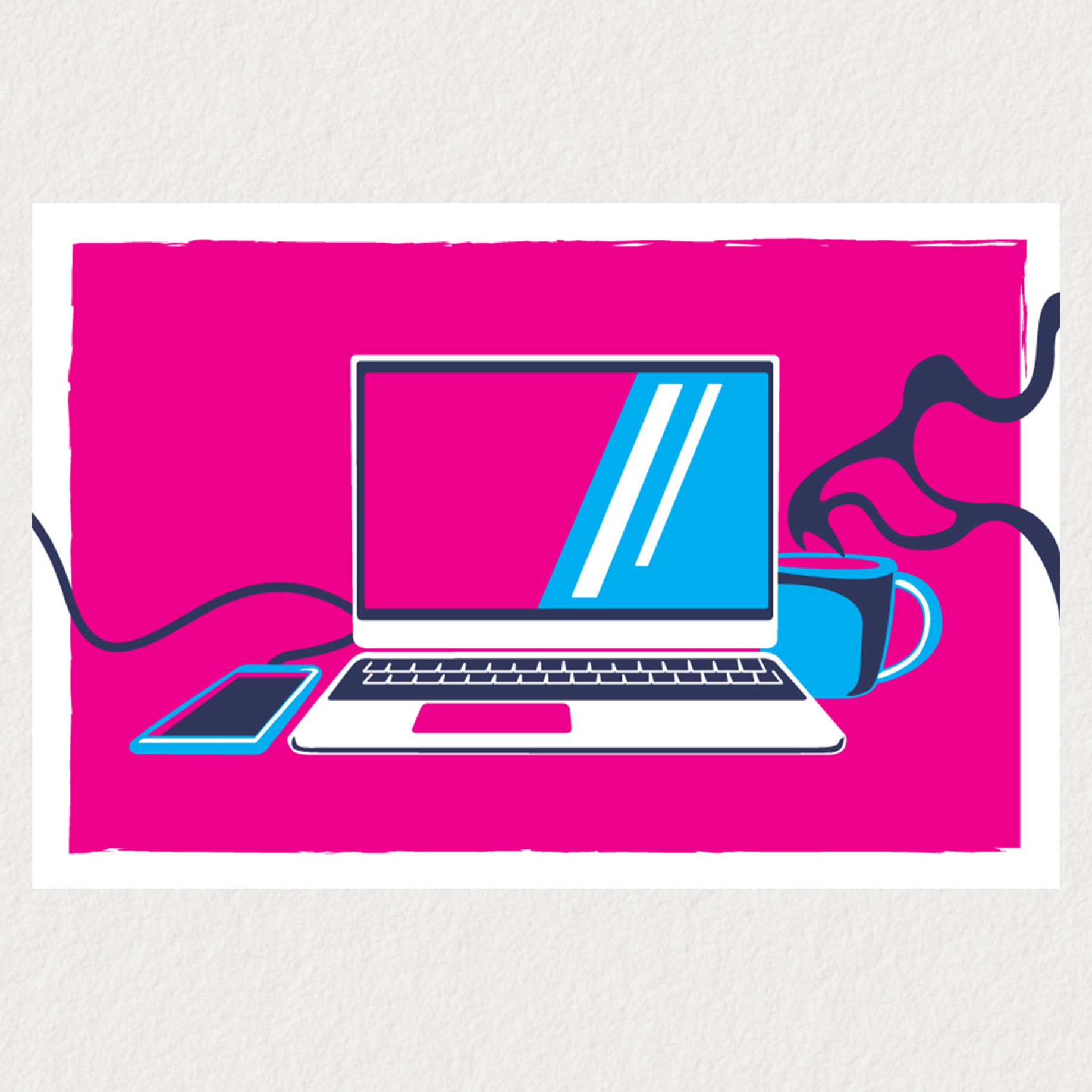
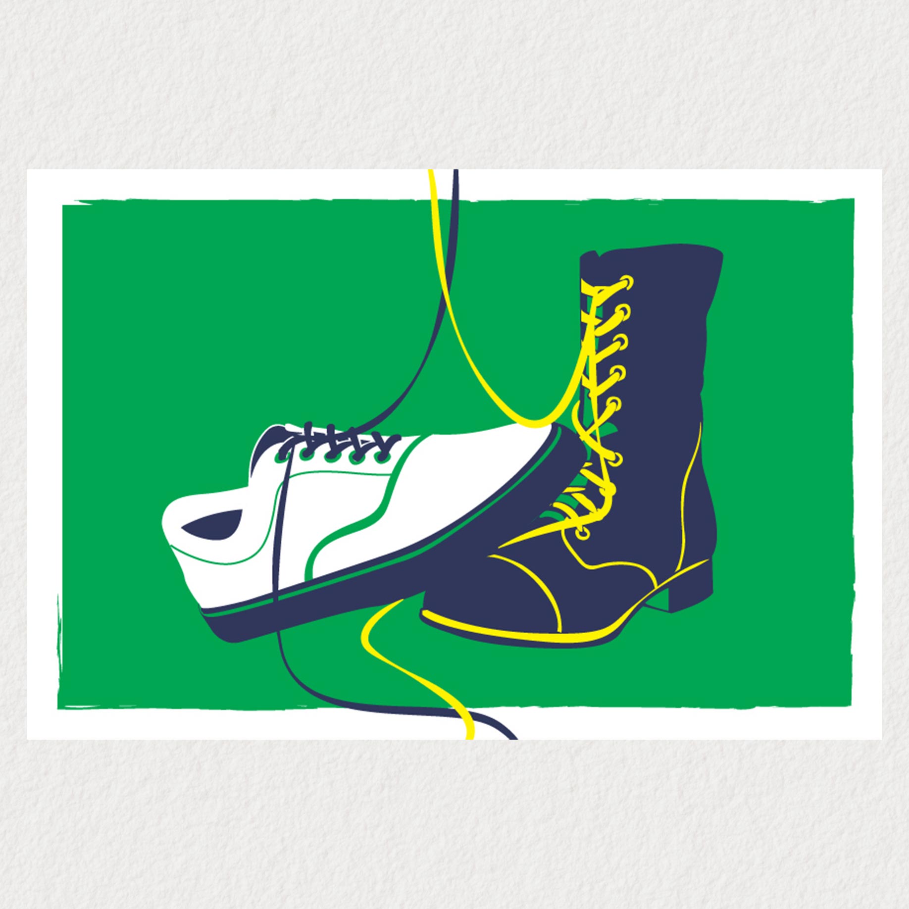
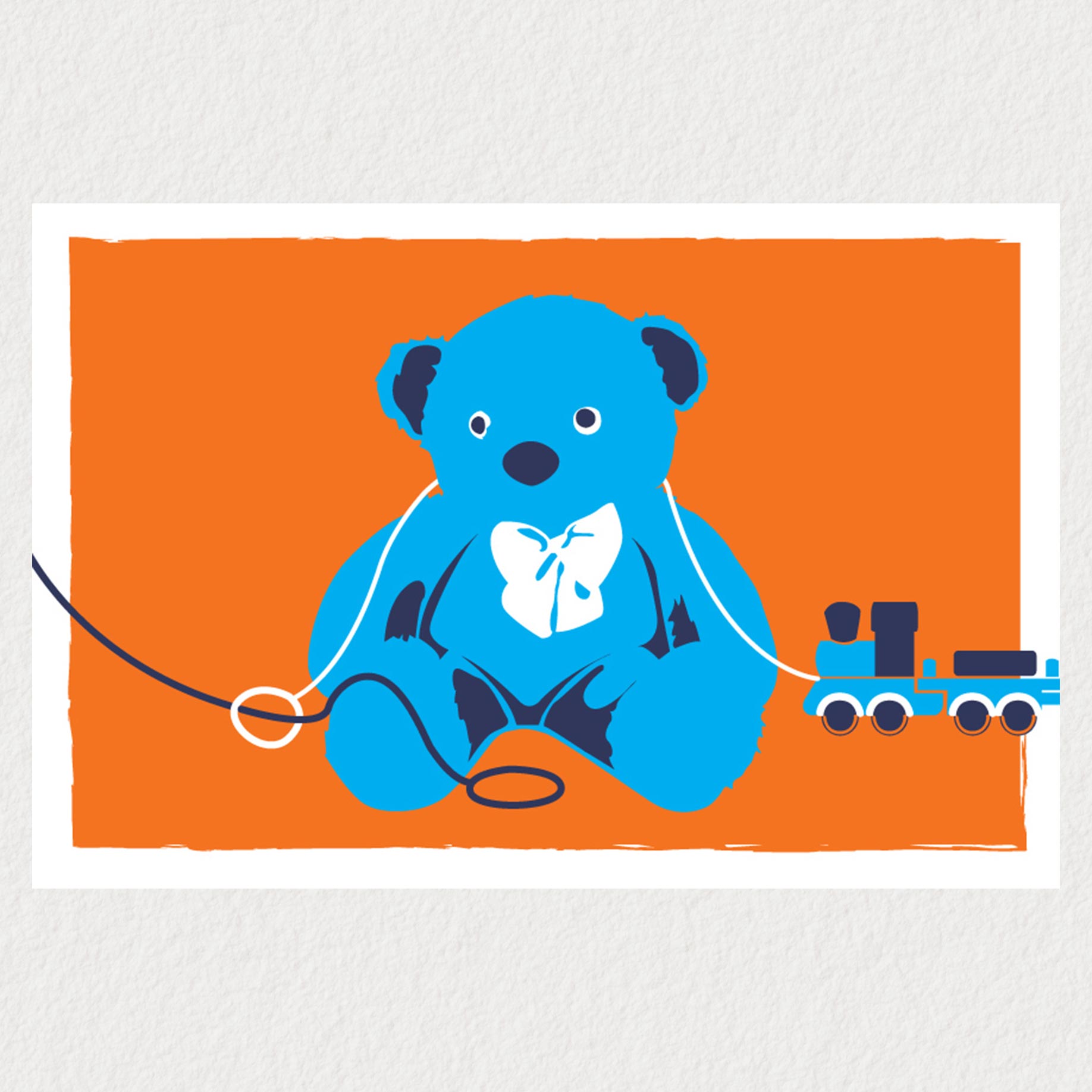
This was a digital design and screenprinting project for a class at my university. I have a strong personal connection to this project as it communicates what I value most in life: my health, my relationship with my partner, my current and future family, and my work. I used a set pallette of bright colors to tie each card together into a cohesive set. It was a great exercise for symbolism and a fun opportunity to use a graphic, punchy design style.
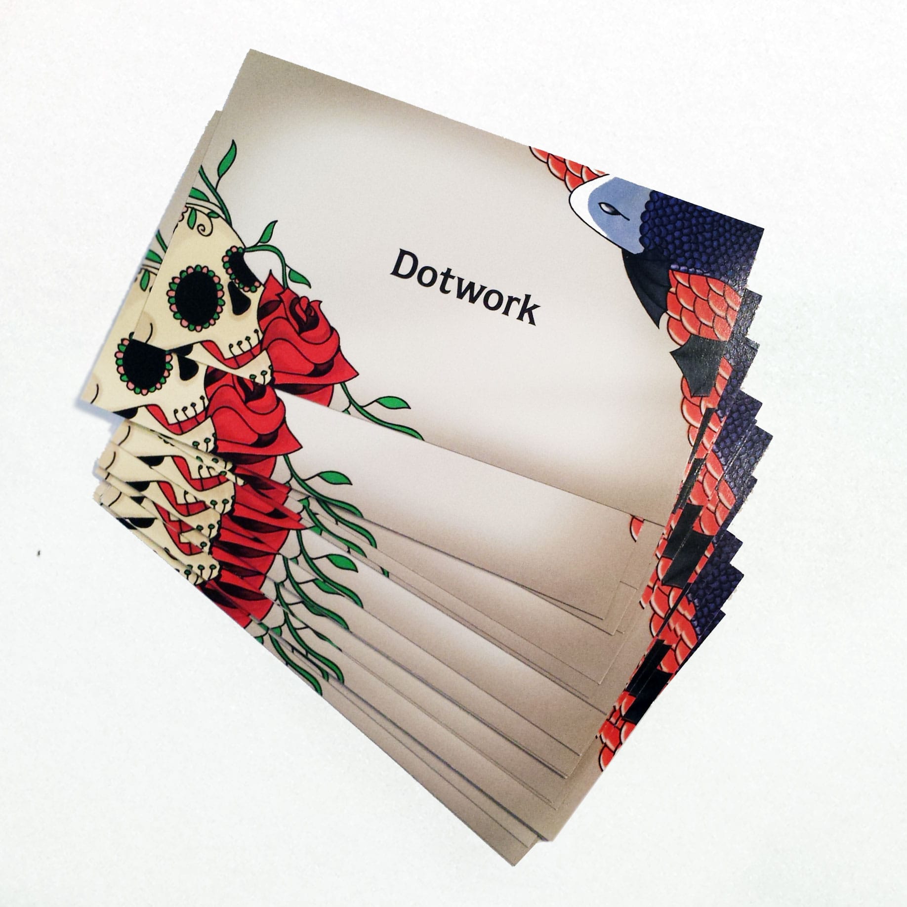
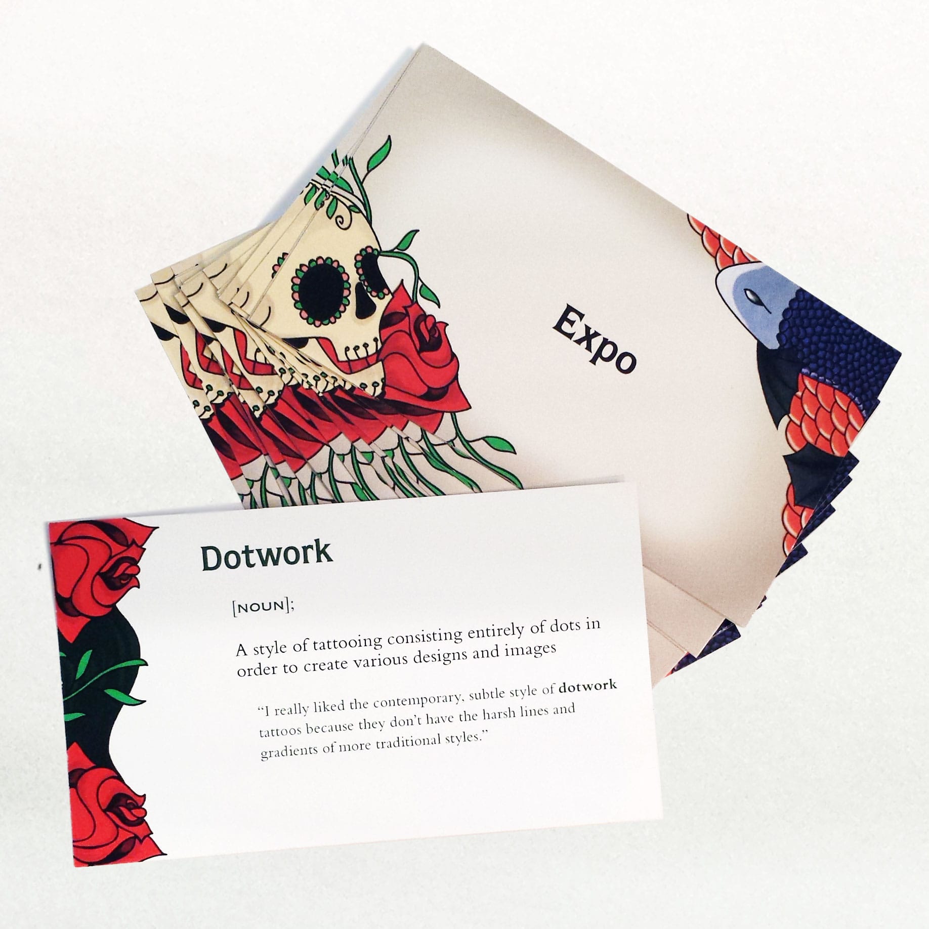
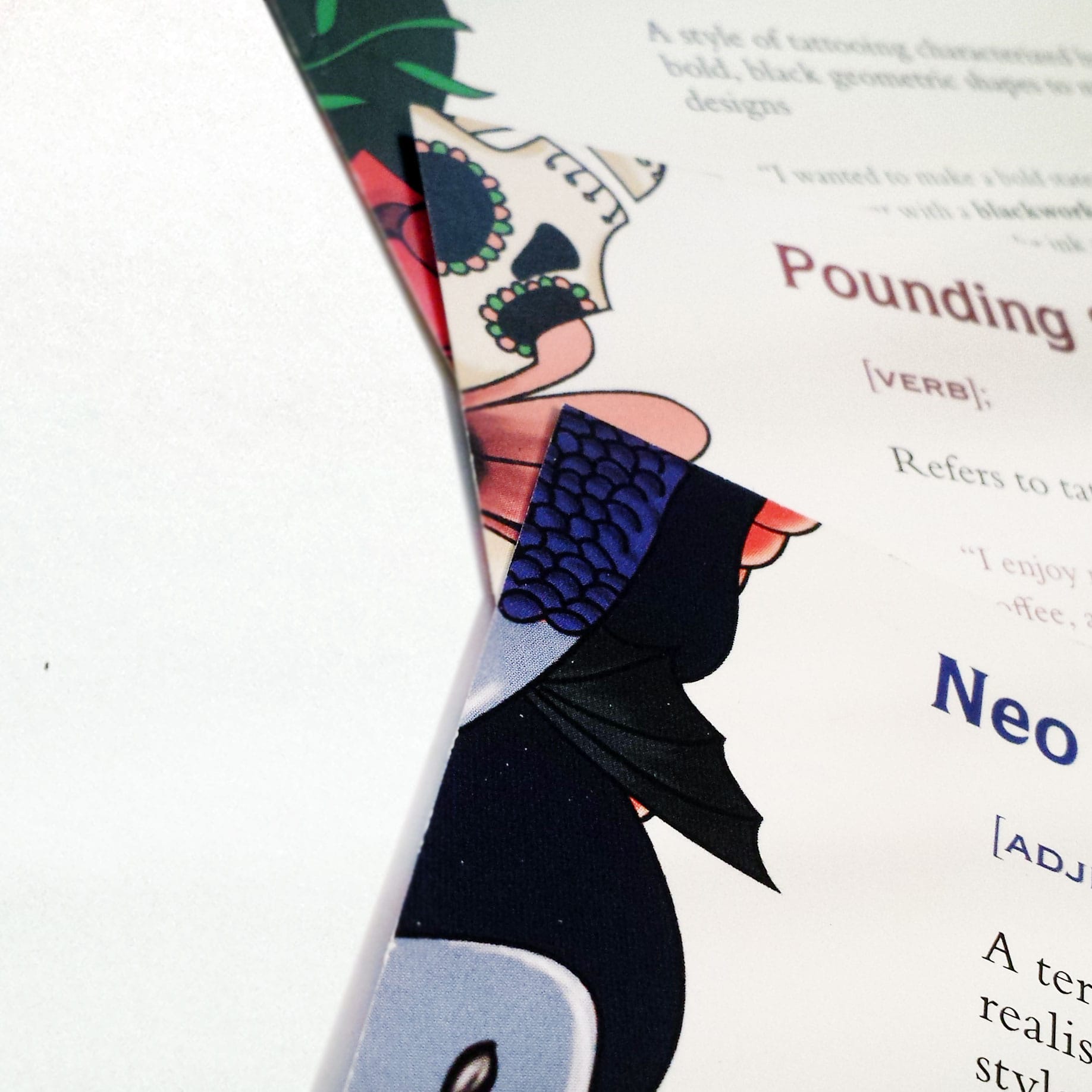
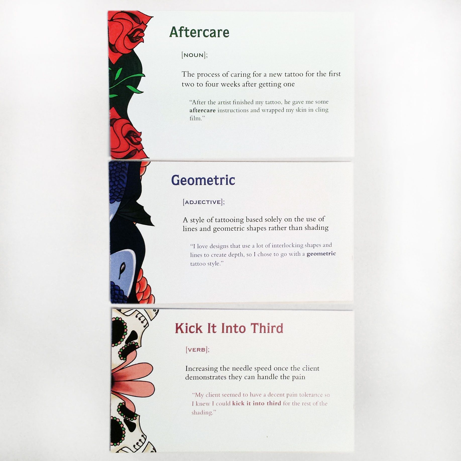
This was a typography and illustration project for a class at my university. We were instructed to choose a topic we were interested in and design a set of 26 definition cards around that topic, with each card starting with one letter of the alphabet. We then needed to divide the cards into different categories using design differences. I chose to divide them based on parts of speech (noun, verb, and adjective).
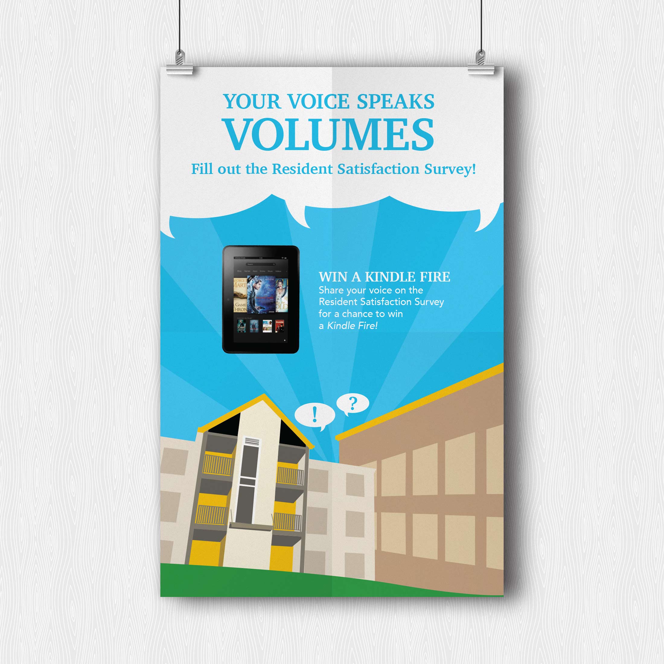
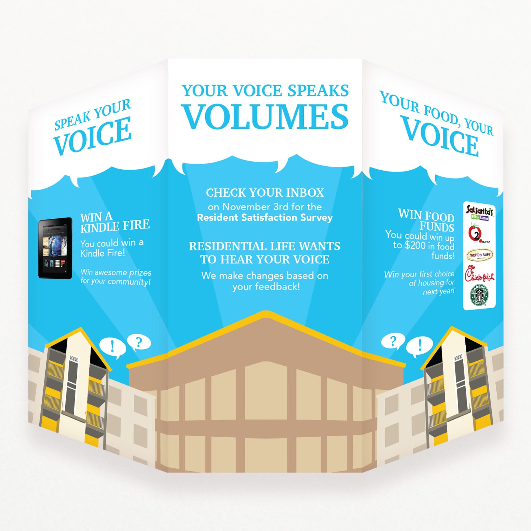
This was a print advertising and motion graphic project for the Residential Life Office at my university. I designed a poster set, table tent, and silent motion graphic video to advertise the Resident Survey being circulated to the on-campus student body. This annual survey provided the Residential Life Office with crucial data that helped inform and enact changes to the resident system on campus, but the number of students participating needed drastic improvement. The posters and table tents were placed in various locations around campus, and the video was broadcast on their iNet television systems in dining halls and public areas. After this campaign, the office saw a 10%+ rise in survey participation.
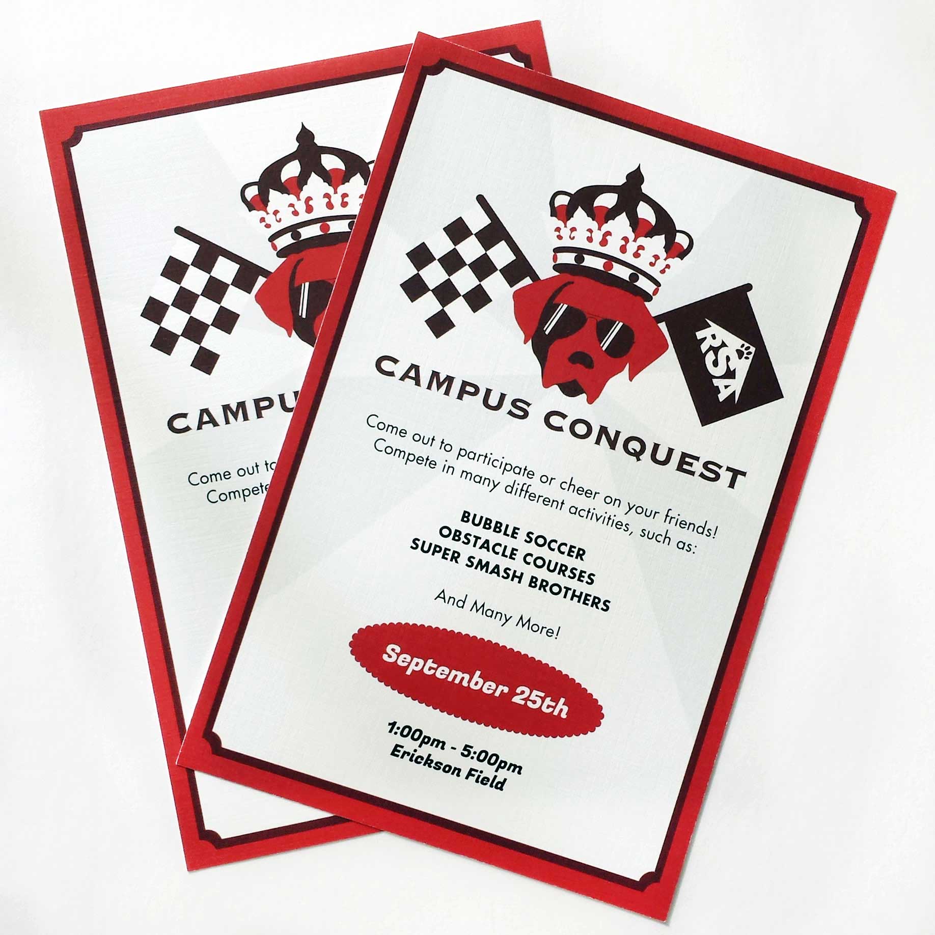
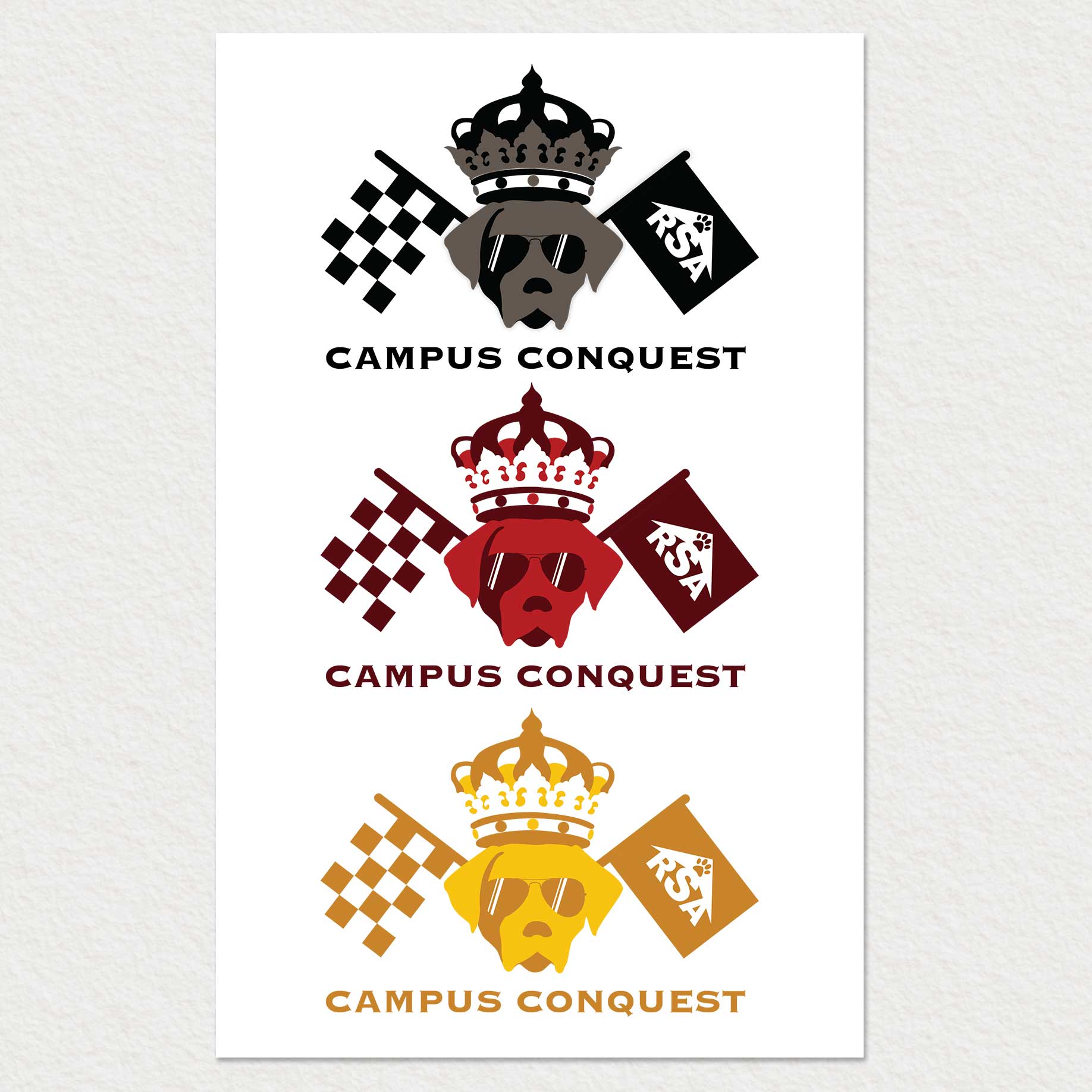
This was a branding project for the Residential Life office and Resident Student Association at my university. They needed a logo and print advertisement for their upcoming Campus Conquest Event, an outdoor activity day for students. I based the logo design on the university mascot, True Grit, the Chesapeake Bay retriever. The design also features the Resident Student Association logo, which I designed for them previously.
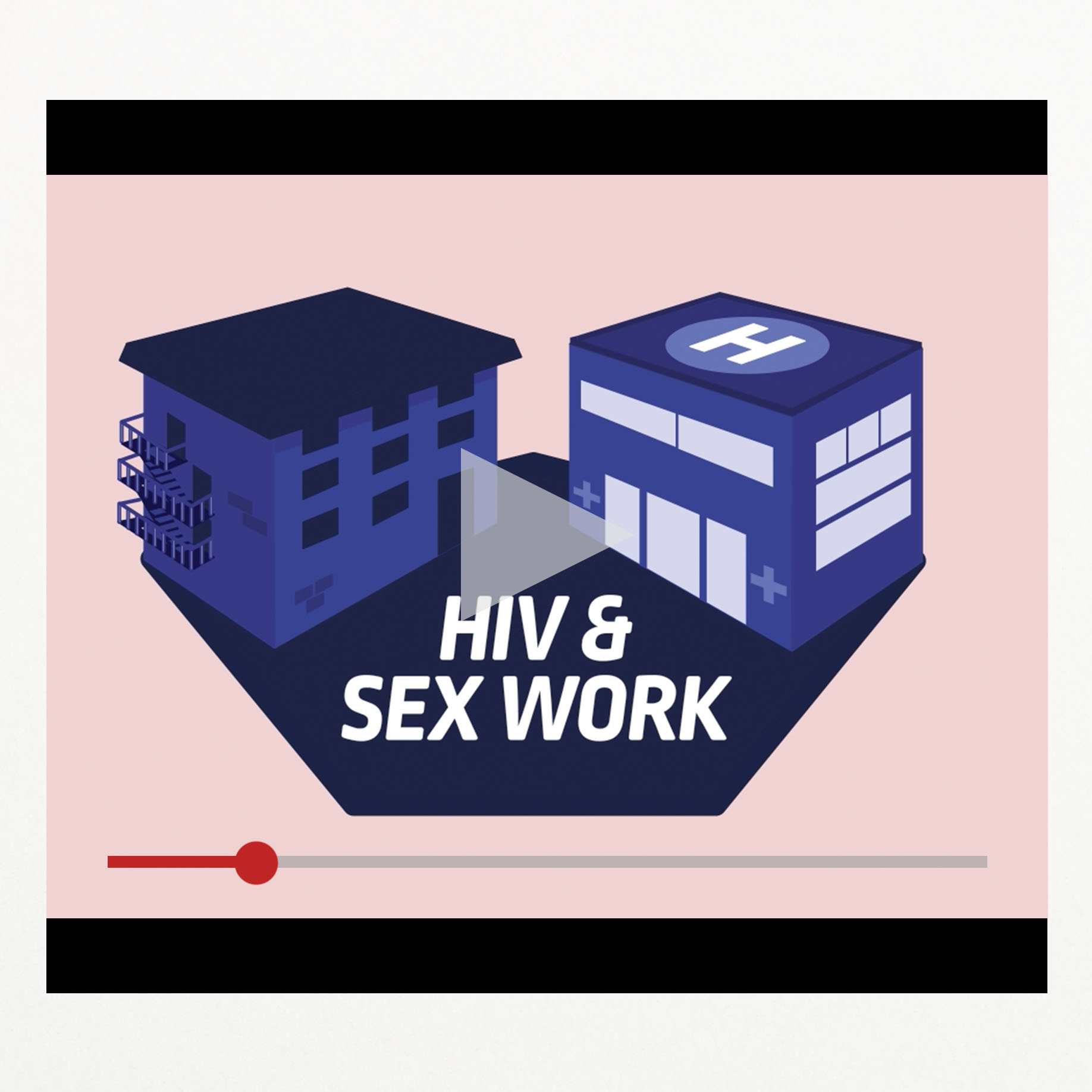
This was a motion graphic project for a class at my university. We had the opportunity to work with a representative of Jpheigo, a non-profit health organization affiliated with The Johns Hopkins University dedicated to improving the health of women and families. We were instructed to research a topic that affects women's health and create a motion graphic video discussing our topic. I chose to discuss the issue of HIV in the world of sex work, the stigma surrounding it, and the ways in which we could address the issue with proper legalization, regulation, and health care access.